Six Sigma Q & A
41
Six Sigma – Q & A
Transcript of Six Sigma Q & A
Six Sigma – Q & A

Shift in Business Focus
Business
Focus <1950 1950
to1970’s 1980’s 1990’s 2000’s
Productivity
Quality
Customer
Satisfaction
Cost
Agility/Speed
Flexibility
Adaptability
Product life
cycle
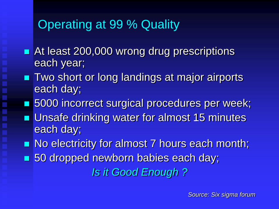
Operating at 99 % Quality
At least 200,000 wrong drug prescriptions
each year;
Two short or long landings at major airports each day;
5000 incorrect surgical procedures per week;
Unsafe drinking water for almost 15 minutes each day;
No electricity for almost 7 hours each month;
50 dropped newborn babies each day;
Is it Good Enough ?
Source: Six sigma forum
What is Six Sigma?
Born in Motorola in 1992.
High performance, data driven approach for
analyzing the root causes of business
processes/ problems and solving them.
Links Customers, Process improvements with
financial results.
What is Six Sigma?
Greek character used in statistics;
Measures the capability of the process to
perform defect free work i.e. variation -
standard deviation – i.e. how far a measured
result is from the average;
Six Sigma – Upper and lower specification
limits are 6 standard deviations from the
average;
Defect – anything which leads to customer
dissatisfaction
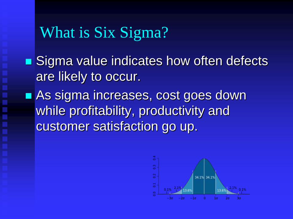
What is Six Sigma?
Sigma value indicates how often defects
are likely to occur.
As sigma increases, cost goes down
while profitability, productivity and
customer satisfaction go up.
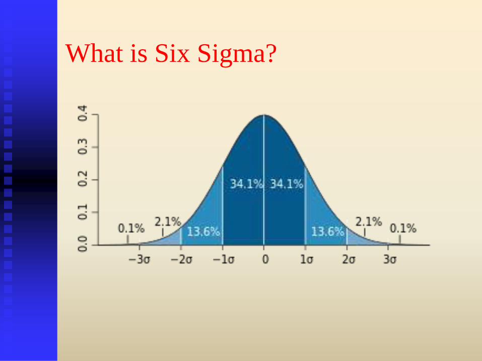
What is Six Sigma?
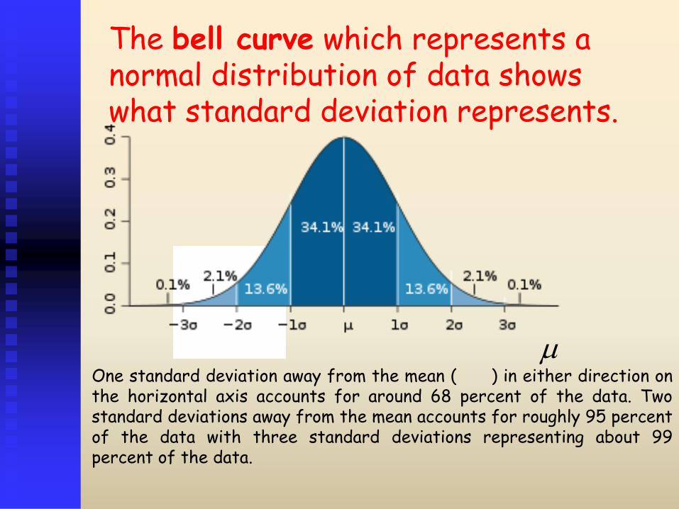
The bell curve which represents a normal distribution of data shows what standard deviation represents.
One standard deviation away from the mean ( ) in either direction on the horizontal axis accounts for around 68 percent of the data. Two standard deviations away from the mean accounts for roughly 95 percent of the data with three standard deviations representing about 99 percent of the data.

Six Sigma Failure Rates
Sigma
Level
Defects per Million Opportunities
1 697,672
2 308,770
3 66,810
4 6,209
5 232
6 3.4
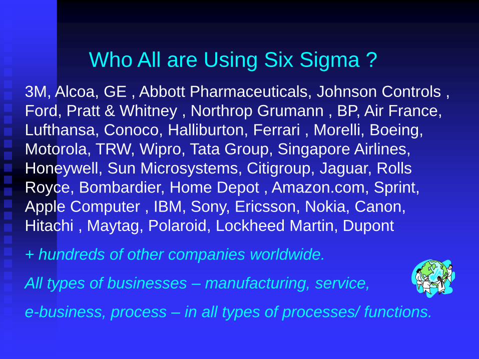
Who All are Using Six Sigma ?
3M, Alcoa, GE , Abbott Pharmaceuticals, Johnson Controls ,
Ford, Pratt & Whitney , Northrop Grumann , BP, Air France,
Lufthansa, Conoco, Halliburton, Ferrari , Morelli, Boeing,
Motorola, TRW, Wipro, Tata Group, Singapore Airlines,
Honeywell, Sun Microsystems, Citigroup, Jaguar, Rolls
Royce, Bombardier, Home Depot , Amazon.com, Sprint,
Apple Computer , IBM, Sony, Ericsson, Nokia, Canon,
Hitachi , Maytag, Polaroid, Lockheed Martin, Dupont
+ hundreds of other companies worldwide.
All types of businesses – manufacturing, service,
e-business, process – in all types of processes/ functions.
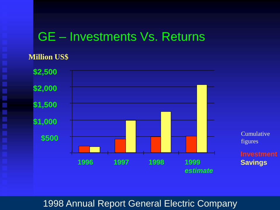
GE – Investments Vs. Returns
1998 Annual Report General Electric Company
$500
$1,000
$1,500
$2,000
$2,500
1996 1997 1998 1999
estimate
Million US$
Investment
Savings
Cumulative
figures
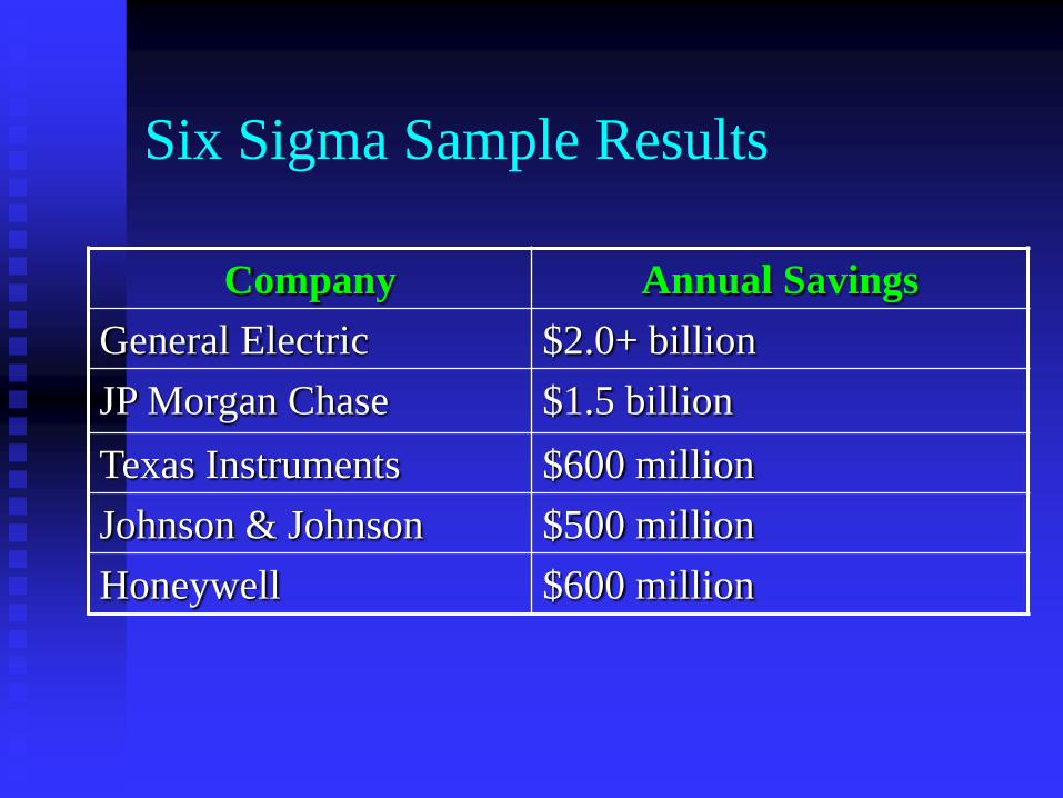
Six Sigma Sample Results
Company Annual Savings
General Electric $2.0+ billion
JP Morgan Chase $1.5 billion
Texas Instruments $600 million
Johnson & Johnson $500 million
Honeywell $600 million
Six Sigma Methodology
Based on Dr. Deming & Dr. Juran philosophy;
Dr. Deming's PDSA cycle to continually improve the process in terms of quality, cost and delivery.
Dr. Juran - improvement is achieved project by project.
US $ 100,000 to 250,000 savings per Six Sigma project.
Process Efficiency and Effectiveness
Process Effectiveness: The process is effective if
the output meets customer needs e.g. % of orders
delivered on time to the customers.
Process Efficiency: Process is efficient when it is
effective at the least cost e.g. time taken to deliver
goods to customer on time.
Maximizing effectiveness and efficiency together
means that process produces high quality at low
cost i.e. providing most value to customer.

Six Sigma Methodology
DMAIC process :
Define;
Measure;
Analyse;
Improve;
Control.

Six Sigma Methodology - Define
Poorly performing areas are identified and
prioritized through use of data;
Use of 7 QC tools like Check sheets, Pareto
diagram, Cause & Effect.
Make a business case for improvement;
Form teams & issue charter.

Six Sigma Methodology - Measure
Identify suspected problem process;
Is the process aligned with organisations
strategic goals?
How will we know we are successful?
What is the capability of the process?
Use of process flow charts, FMEA etc.
Six Sigma Methodology - Analyze
When, where and why do defects occur i.e.
understand exactly what is happening
within a process and why defects are
occurring;
Use of statistical tools like Input/ Output
matrices, Scatter plots, Hypothesis testing

Six Sigma Methodology
Improve
Vital factors in the process are identified;
Experiments systematically designed to focus on factors which can be modified to achieve target goals.
Use of Design of Experiments techniques.
Control:
Process capability and controls;
Use of SPC tools to manage processes on continual basis

The Players
Project Champions;
Master Black Belts;
Black Belts;
Green Belts;
Yellow Belts
The Players – Project Champions
Project Champions are involved in:
selecting projects;
identifying Black and Green Belt candidates;
Set improvement targets
Provide resources;
Review the projects on regular basis and
Remove any road blocks to programs
success.
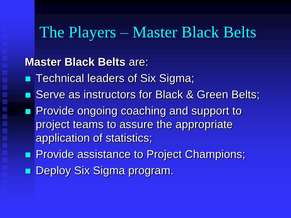
The Players – Master Black Belts
Master Black Belts are:
Technical leaders of Six Sigma;
Serve as instructors for Black & Green Belts;
Provide ongoing coaching and support to
project teams to assure the appropriate
application of statistics;
Provide assistance to Project Champions;
Deploy Six Sigma program.

The Players – Black Belts
Black Belts are:
Backbone of Six Sigma deployment;
Highly qualified;
Lead teams;
Attack chronic problems;
Manage projects;
“ Drive “ teams for solutions that work;
Responsible for bottom line results.

The Players – Green Belts
Green Belts:
Provide team support to Black Belts;
Assist in data collection, input;
Analyse data using software;
Prepare reports for management.
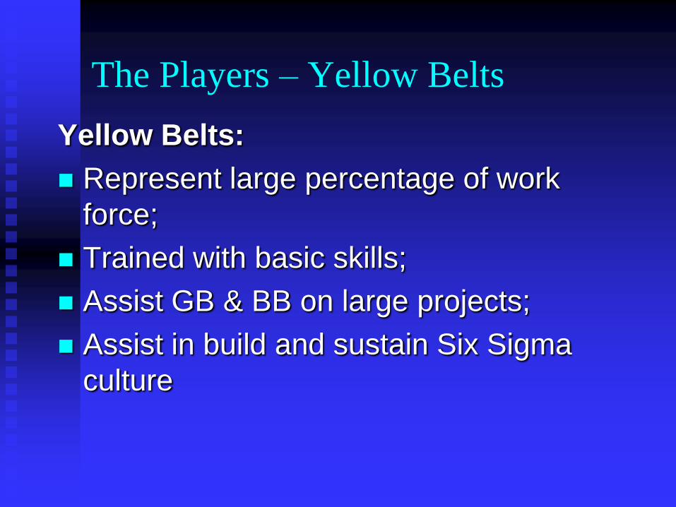
The Players – Yellow Belts
Yellow Belts:
Represent large percentage of work
force;
Trained with basic skills;
Assist GB & BB on large projects;
Assist in build and sustain Six Sigma
culture
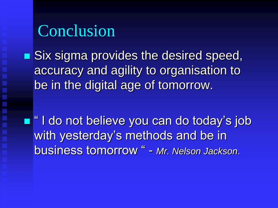
Conclusion
Six sigma provides the desired speed,
accuracy and agility to organisation to
be in the digital age of tomorrow.
“ I do not believe you can do today’s job
with yesterday’s methods and be in
business tomorrow “ - Mr. Nelson Jackson.

What is SPC?
SPC stands for Statistical Process Control
SPC does not refer to a particular technique, algorithm or procedure
SPC is an optimisation philosophy concerned with continuous process
improvements, using a collection of (statistical) tools for
o data and process analysis
o making inferences about process behaviour
o decision making
SPC is a key component of Total Quality initiatives
Ultimately, SPC seeks to maximise profit by
o improving product quality
o improving productivity
o streamlining process
o reducing wastage
o reducing emissions o improving customer service, etc.
Tools for SPC
Commonly used tools in SPC include
o Flow charts
o Run charts
o Pareto charts and analysis
o Cause-and-effect diagrams
o Frequency histograms
o Control charts
o Process capability studies
o Acceptance sampling plans
o Scatter diagrams
Each tool is simple to implement
These tools are usually used to complement each other, rather than employed as
stand-alone techniques
SPC Tools - Flow Charts
Flow charts
o have no statistical basis
o are excellent visualisation tools
Flow charts show
o the progress of work
o the flow of material or information through a sequence of operations
Flow charts are useful in an initial process analysis
Flow charts should be complemented by process flow sheets or process flow
diagrams (more detailed) if available
Everyone involved in the project should draw a flow chart of the process being studied so as to reveal the different perceptions of how the process operates
Example flow chart of a procedure to ensure data quality

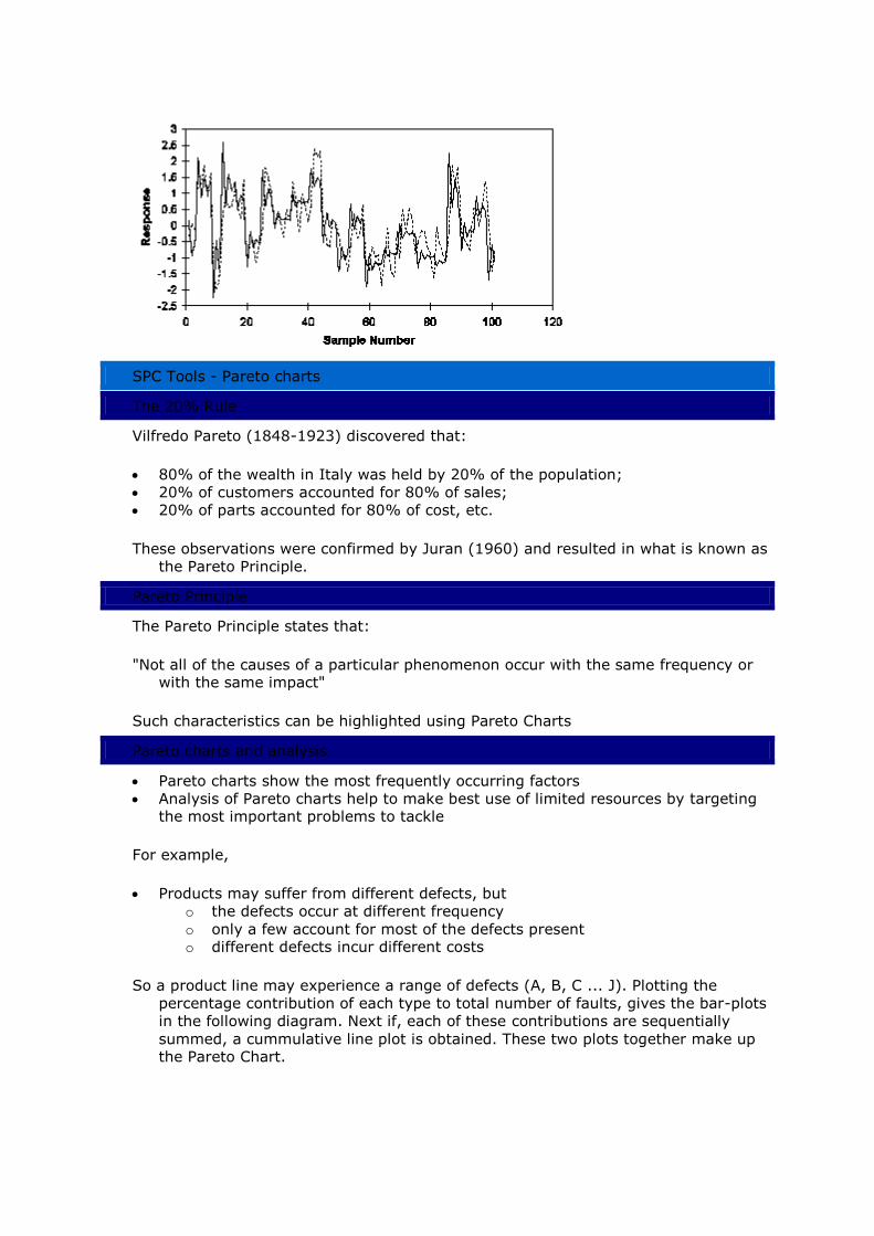
SPC Tools - Run charts
Run charts are simply plots of process characteristics against time or in chronological sequence. They do not have statistical basis, but are useful in revealing
trends relationships between variables
Example of Run Chart with two responses
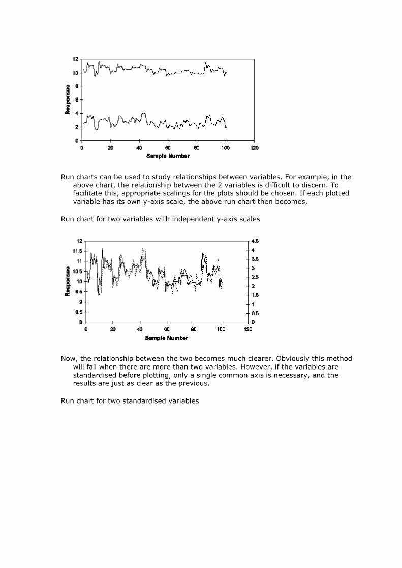
Run charts can be used to study relationships between variables. For example, in the
above chart, the relationship between the 2 variables is difficult to discern. To
facilitate this, appropriate scalings for the plots should be chosen. If each plotted variable has its own y-axis scale, the above run chart then becomes,
Run chart for two variables with independent y-axis scales
Now, the relationship between the two becomes much clearer. Obviously this method
will fail when there are more than two variables. However, if the variables are
standardised before plotting, only a single common axis is necessary, and the results are just as clear as the previous.
Run chart for two standardised variables
SPC Tools - Pareto charts
The 20% Rule
Vilfredo Pareto (1848-1923) discovered that:
80% of the wealth in Italy was held by 20% of the population;
20% of customers accounted for 80% of sales;
20% of parts accounted for 80% of cost, etc.
These observations were confirmed by Juran (1960) and resulted in what is known as
the Pareto Principle.
Pareto Principle
The Pareto Principle states that:
"Not all of the causes of a particular phenomenon occur with the same frequency or with the same impact"
Such characteristics can be highlighted using Pareto Charts
Pareto charts and analysis
Pareto charts show the most frequently occurring factors
Analysis of Pareto charts help to make best use of limited resources by targeting the most important problems to tackle
For example,
Products may suffer from different defects, but
o the defects occur at different frequency
o only a few account for most of the defects present o different defects incur different costs
So a product line may experience a range of defects (A, B, C ... J). Plotting the
percentage contribution of each type to total number of faults, gives the bar-plots
in the following diagram. Next if, each of these contributions are sequentially
summed, a cummulative line plot is obtained. These two plots together make up the Pareto Chart.
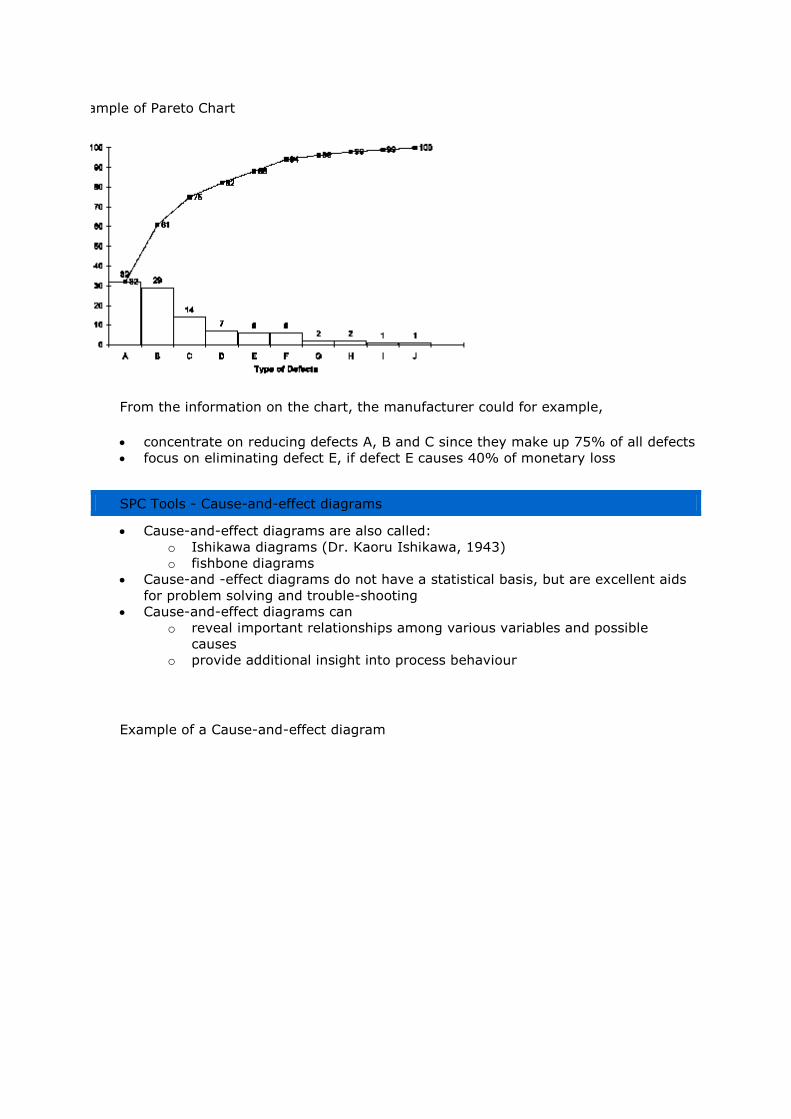
Example of Pareto Chart
From the information on the chart, the manufacturer could for example,
concentrate on reducing defects A, B and C since they make up 75% of all defects
focus on eliminating defect E, if defect E causes 40% of monetary loss
SPC Tools - Cause-and-effect diagrams
Cause-and-effect diagrams are also called:
o Ishikawa diagrams (Dr. Kaoru Ishikawa, 1943)
o fishbone diagrams
Cause-and -effect diagrams do not have a statistical basis, but are excellent aids
for problem solving and trouble-shooting
Cause-and-effect diagrams can
o reveal important relationships among various variables and possible
causes
o provide additional insight into process behaviour
Example of a Cause-and-effect diagram

SPC Tools - Frequency histograms
The frequency histogram is a very effective graphical and easily interpreted
method for summarising data
The frequency histogram is a fundamental statistical tool of SPC
It provides information about:
o the average (mean) of the data
o the variation present in the data
o the pattern of variation
o whether the process is within specifications
Example frequency histogram
Drawing Frequency Histograms
In drawing frequency histograms, bear in mind the following rules:
Intervals should be equally spaced
Select intervals to have convenient values
Number of intervals is usually between 6 to 20

o Small amounts of data require fewer intervals o 10 intervals is sufficient for 50 to 200 readings
SPC Tools - Control charts
Processes that are not in a state of statistical control
show excessive variations exhibit variations that change with time
A process in a state of statistical control is said to be statistically stable. Control charts
are used to detect whether a process is statistically stable. Control charts differentiates between variations
that is normally expected of the process due chance or common causes that change over time due to assignable or special causes
Control charts: common cause variations
Variations due to common causes
have small effect on the process
are inherent to the process because of:
o the nature of the system
o the way the system is managed
o the way the process is organised and operated
can only be removed by
o making modifications to the process
o changing the process are the responsibility of higher management
Control charts: special cause variations

Variations due to special causes are
localised in nature
exceptions to the system
considered abnormalities
often specific to a
o certain operator
o certain machine o certain batch of material, etc.
Investigation and removal of variations due to special causes are key to process improvement
Note: Sometimes the delineation between common and special causes may not be very
clear
Control charts: how they work
The principles behind the application of control charts are very simple and are based on
the combined use of
run charts
hypothesis testing
The procedure is
sample the process at regular intervals
plot the statistic (or some measure of performance), e.g.
o mean
o range
o variable
o number of defects, etc.
check (graphically) if the process is under statistical control if the process is not under statistical control, do something about it
Control charts: types of charts
Different charts are used depending on the nature of the charted data Commonly used
charts are:
for continuous (variables) data
o Shewhart sample mean ( -chart)
o Shewhart sample range (R-chart)
o Shewhart sample (X-chart)
o Cumulative sum (CUSUM)
o Exponentially Weighted Moving Average (EWMA) chart
o Moving-average and range charts
for discrete (attributes and countable) data
o sample proportion defective (p-chart)
o sample number of defectives (np-chart)
o sample number of defects (c-chart)
o sample number of defects per unit (u-chart or -chart)
Control charts: assumptions

Control charts make assumptions about the plotted statistic, namely
it is independent, i.e. a value is not influenced by its past value and will not affect
future values
it is normally distributed, i.e. the data has a normal probability density function
Normal Probability Density Function
The assumptions of normality and independence enable predictions to be made about
the data.
Control charts: properties of the normal distribution
The normal distribution N(,2) has several distinct properties:
The normal distribution is bell-shaped and is symmetric
The mean, , is located at the centre
The probabilities that a point, x, lies a certain distance beyond the mean are:
o Pr(x > + 1.96) = Pr(x > - 1.96) = 0.025
o Pr(x > + 3.09) = Pr(x > - 3.09) = 0.001
is the standard deviation of the data
Control charts: interpretation
Control charts are normal distributions with an added time dimension

Control charts are run charts with superimposed normal distributions
Control charts: a graphical means for hypothesis testing
Control charts provide a graphical means for testing hypotheses about the data being
monitored. Consider the commonly used Shewhart Chart as an example.
Shewhart X-chart with control and warning limits
The probability of a sample having a particular value is given by its location on the chart.
Assuming that the plotted statistic is normally distributed, the probability of a value lying beyond the:
warning limits is approximately 0.025 or 2.5% chance
control limits is approximately 0.001 or 0.1% chance, this is rare and indicates

that
o the variation is due to an assignable cause
o the process is out-of-statistical control
Control charts: run rules for Shewhart charts
Run rules are rules that are used to indicate out-of-statistical control situations. Typical
run rules for Shewhart X-charts with control and warning limits are:
a point lying beyond the control limits
2 consecutive points lying beyond the warning limits (0.025x0.025x100 = 0.06%
chance of occurring)
7 or more consecutive points lying on one side of the mean ( 0.57x100 = 0.8%
chance of occurring and indicates a shift in the mean of the process)
5 or 6 consecutive points going in the same direction (indicates a trend)
Other run rules can be formulated using similar principles
Control charts: CuSum charts
CUSUM Charts are excellent for detecting changes in means. A CUSUM Chart is simply a
plot of the sum of some process characteristic against time. Examples of typical
characteristics that are plotted are:
the raw variable Xi
difference between the raw variable and a target Xi - Xtarget
difference between the raw variable and its mean Xi -
difference between successive variables Xi - Xi-1
Control charts: examples
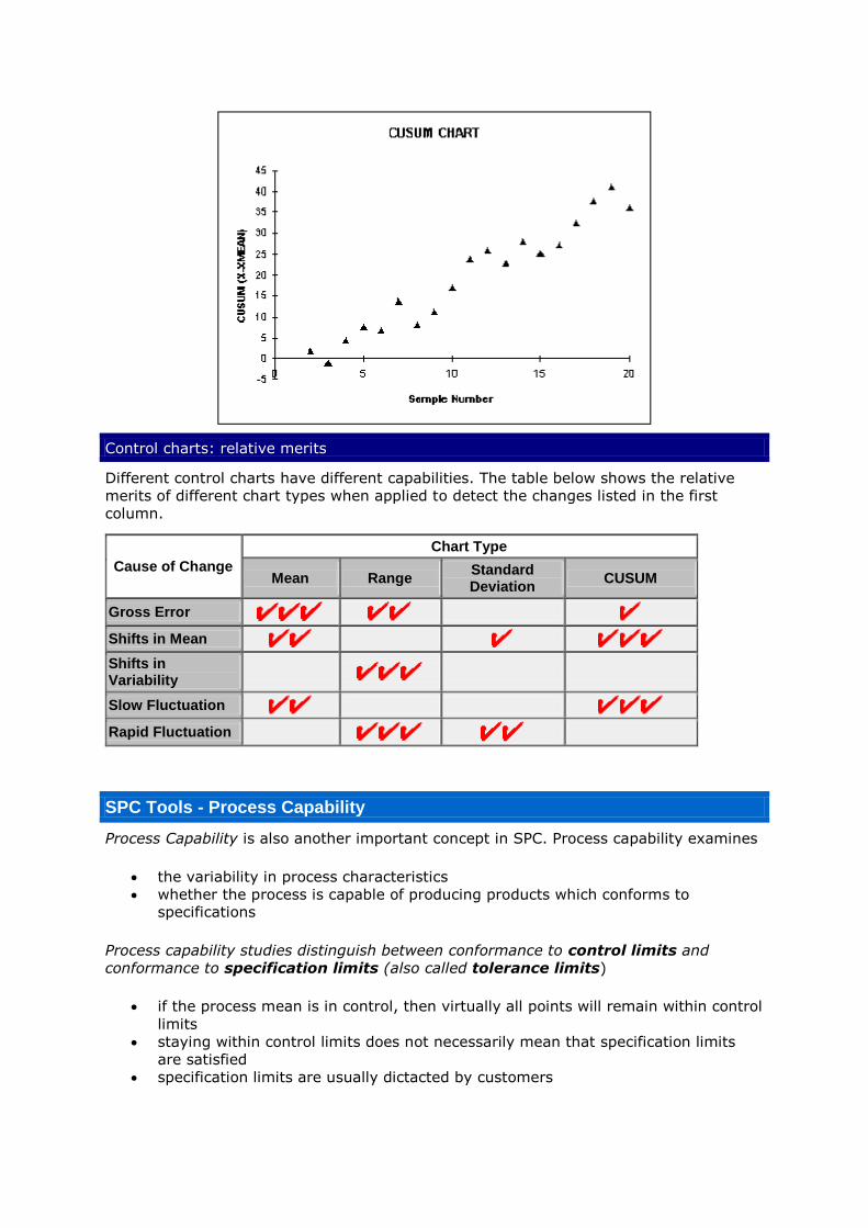
Control charts: relative merits
Different control charts have different capabilities. The table below shows the relative
merits of different chart types when applied to detect the changes listed in the first
column.
Cause of Change
Chart Type
Mean Range Standard Deviation
CUSUM
Gross Error
Shifts in Mean
Shifts in Variability
Slow Fluctuation
Rapid Fluctuation
SPC Tools - Process Capability
Process Capability is also another important concept in SPC. Process capability examines
the variability in process characteristics
whether the process is capable of producing products which conforms to specifications
Process capability studies distinguish between conformance to control limits and
conformance to specification limits (also called tolerance limits)
if the process mean is in control, then virtually all points will remain within control
limits
staying within control limits does not necessarily mean that specification limits
are satisfied
specification limits are usually dictacted by customers

SPC Tools - Process Capability
Process Capability is also another important concept in SPC. Process capability
examines
the variability in process characteristics
whether the process is capable of producing products which conforms to specifications
Process capability studies distinguish between conformance to control limits and conformance to specification limits (also called tolerance limits)
if the process mean is in control, then virtually all points will remain
within control limits
staying within control limits does not necessarily mean that
specification limits are satisfied specification limits are usually dictacted by customers
Process capability: concepts
The following distributions show different process scenarios. Note the
relative positions of the control limits and specification limits.
In control and product meets
specifications.
Control limits are within
specification limits
In control but some products
do not meet specifications.
Specification limits are within
control limits

Process capability: relative capability
Data from process with low
capability
Data from process with
medium capability
Data from process with high
capability
Process capability: capability index
The capability index is defined as:
Cp = (allowable range)/6 = (USL - LSL)/6
The capability index show how well a process is able to meet specifications.
The higher the value of the index, the more capable is the process:
Cp < 1 (process is unsatisfactory)
1 < Cp < 1.6 ( process is of medium relative capability)

Cp > 1.6 (process shows high relative capability)
Process capability: process performance index
The capability index
considers only the spread of the characteristic in relation to
specification limits assumes two-sided specification limits
The product can be bad if the mean is not set appropriately. The process performance index takes account of the mean ( and is defined as:
Cpk = min[ (USL - )/3, ( - LSL)/3s ]
The process performance index can also accommodate one sided specification limits
for upper specification limit: Cpk = (USL - )/3
for lower specification limit: Cpk = ( - LSL)/3
Process capability: the message
The message from process capability studies is:
first reduce the variation in the process
then shift the mean of the process towards the target
This procedure is illustrated in the diagram below: