Cristina Rotundo_Design Portfolio
206
-
Upload
cristina-rotundo -
Category
Documents
-
view
213 -
download
0
description
Cristina Rotundo_Design Portfolio
Transcript of Cristina Rotundo_Design Portfolio

002 S P E C I A L R E L A T I V I T Y cristina rotundo visual design portfolio/

003

004 S P E C I A L R E L A T I V I T Y cristina rotundo visual design portfolio/

SPECIAL RELATIVITYcristina rotundo / visual design portfolio
006 S P E C I A L R E L A T I V I T Y cristina rotundo visual design portfolio/
SPECIAL RELATIVITYEvery frame of reference I am asked to navigate and understand, I must be smart, and decipher what it is exactly that I need to focus on in order to make a design move. I must always consider how the core of my concept relates to what is important to the audience, to the environment and to the client.
The work found in this book are my explorations of relationships created between the core elements within my design projects. Within each projects introduction, there is an image that represents the subject of the design within or interacting with col-ored circles which represents a frame of reference. All together, this portfolio is my own interpretation of special relativity. Enjoy!
Einstein’s Theory of Special Relativity explains that motion is relative to space and time within a frame of reference. To me, there are parallels that can be made between design and this theory. For a design to move or to have impact, there must be a relationship created between it, it’s environment and a cultural context. If these elements relate to each other successfully, an idea will be put into motion. Because of this, I feel graphic design is nothing less than a science.
I have always been curious about how people in-teract with each other and with their environments. Designing has given me a reason to be even more inquisitive about how things are working around me.
00700 . / in t roduct ion
specimens /
Designer
Consumer
Client
Environment
a.)
b.)
c.)
d.)
a.)
b.)
c.)
d.)

008 S P E C I A L R E L A T I V I T Y cristina rotundo visual design portfolio/

00900 . / in t roduct ion

colophon /
Copyright © 2010 All Rights Resreved. No part of this publication
may be reproduced, stored in a retrieval system or transmitted,
in any form or by any means, without the written permission
of Cristina Rotundo.
Cristina Rotundo
Phone / 780-965-1111
Email / [email protected]
Web / www.cristinarotundo.com
Academy of Art University
79 New Montgomery / San Francisco, CA
Department Director / Mary Scott
Course / Portfolio Seminar
Instructor / Mary Scott
Cover Stock, Case Bound / Arrestox BV-19990 Black
Cover Stock, Perfect Bound / Arrestox BV-19990, Chip Board
Text Stock / Neenah Environment 80lb Text 100% Recycled
PC 100 White Smooth Digital
Printer / H&H Imaging, San Francisco, CA
Bindery / The Key Bindery, Oakland, CA
Typefaces / Helvetica Neue, Adobe Garamond, URW Grotesk
Software / Adobe Suite 4
Printer / Indigo Printer
Camera / Canon Digital Rebel SLR
Photography / Personal, Daniel Castro, Erdman Photography
S P E C I A L R E L A T I V I T Y cristina rotundo / visual design portfolio010
01.
02.
03.
04
05.1
05.2
06.
07.
08.
09.
10.1
10.2
10.3
10.4
10.5
11.
12.
012
026
038
050
058
066
078
090
104
112
124
128
142
156
172
184
192
Burt’s Bees Redesigned
Ando Clock Design
Casa del Patrón
Bella & Daisy Dog Bakery
Uninque Innovation
Uninque Invitation
Ted Conference Promotion
R3: No.2 Design Project
Pantone Poster Promotion
Dulcet Paper Promotion
Kmart Redesign
Catherine & Sebastian
c+s
K Soleil
Serendipity
New Orleans Jazz Festival
Logos
TAbLE of ConTEnTS
project no. / project name / page no. /
00 . / in t roduct ion 011
0012 S P E C I A L R E L A T I V I T Y cristina rotundo visual design portfolio/
project no. / objective /
solution /
field of reference /
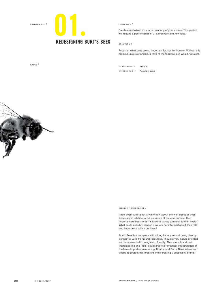
01.REdESIgnIng buRT’S bEES
class name /
instructor /
Print 3
Roland young
Create a revitalized look for a company of your choice. This project will require a poster series of 3, a brochure and new logo.
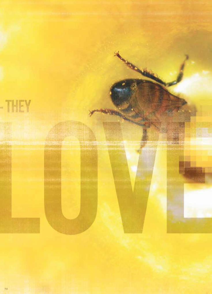
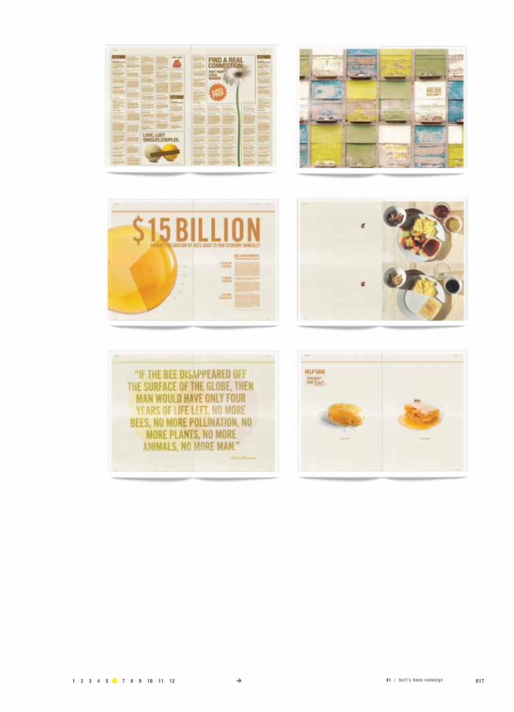
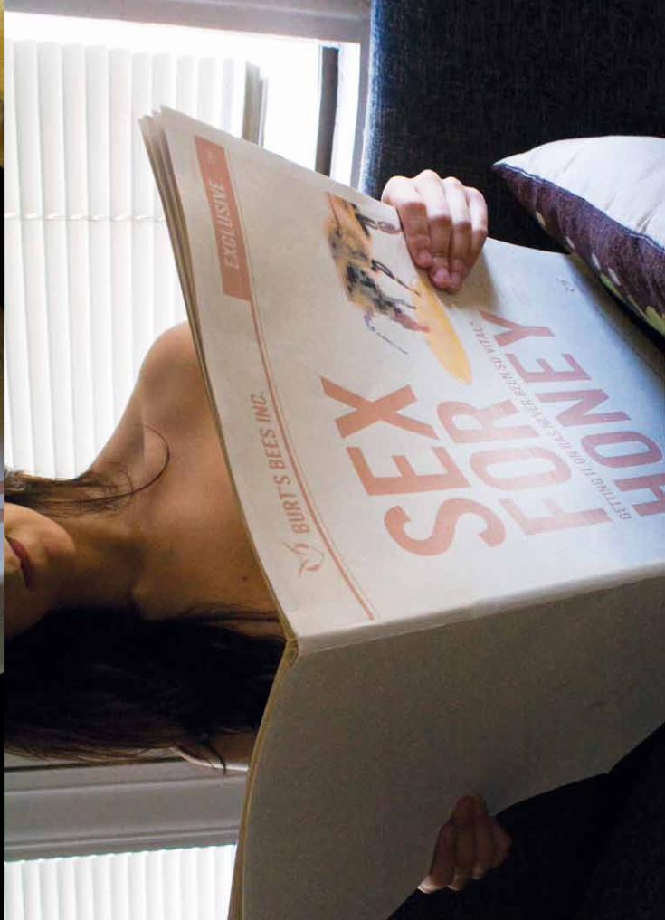
Focus on what bees are so important for, sex for flowers. Without this promiscuous relationship, a third of the food we love would not exist.
I had been curious for a while now about the well being of bees, especially in relation to the condition of the environment. Howimportant are bees to us? Is it worth paying attention to their health? What could possibly happen if we are not informed about their role and importance within our lives?
Burt’s Bees is a company with a long history around being directly connected with it’s natural resources. They are very nature oriented and concerned with being earth friendly. This was a brand that interested me and I felt I could create a refreshed, interpretation of the bee’s important role as a pollinator, and Burt’s Bees values and efforts to protect this creature while creating a successful brand.
specs /

00131 2 3 4 5 6 7 8 9 10 11 12 01 . / bur t ’s bees redes ign
specimens /
Brochure
Posters (3x)
Logo
a.)
b.)
c.)


016 S P E C I A L R E L A T I V I T Y cristina rotundo visual design portfolio/
1 2 3 4 5 6 7 8 9 10 11 12 0 1 701 . / bur t ’s bees redes ign

020 S P E C I A L R E L A T I V I T Y cristina rotundo visual design portfolio/
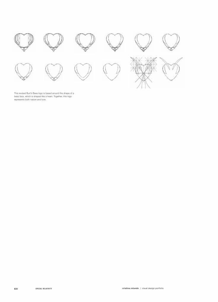
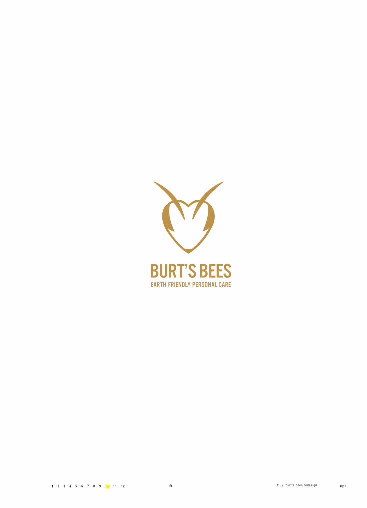
This revised Burt’s Bees logo is based around the shape of a bees face, which is shaped like a heart. Together, this logo represents both nature and love.
1 2 3 4 5 6 7 8 9 10 11 12 0 2 101 . / bur t ’s bees redes ign

022 S P E C I A L R E L A T I V I T Y cristina rotundo visual design portfolio/
1 2 3 4 5 6 7 8 9 10 11 12 0 2 3

024 S P E C I A L R E L A T I V I T Y cristina rotundo visual design portfolio/

1 2 3 4 5 6 7 8 9 10 11 12 0 2 501 . / bur t ’s bees redes ign13 14
026 S P E C I A L R E L A T I V I T Y cristina rotundo visual design portfolio/
project no. / objective /
solution /
field of reference /
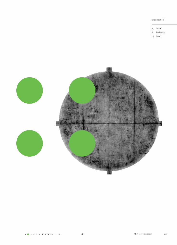
02.Ando CLoCK dESIgn
class name /
instructor /
Pack 3
Tom McNulty
Design and manufacture a clock based around your choice of inspiration. Create packaging, and a logo to showcase and brand.
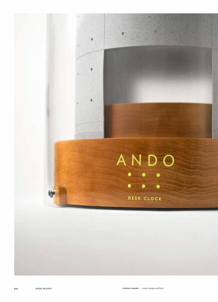
Create a clock design based on the architect, Tadao Ando’s and the architectural call outs that represent the characteristics of his designs.
This project finally gave me the chance to learn more aboutone of my favorite architects. Tadao Ando’s architecture has an extraordinarily universal appeal. Using little more than concrete, glass, and wood, he manages to incorporate the ineffable forces of nature like sunlight, wind, and water into his designs.
I designed this clock based around Ando’s minimal and majestic design, the “Space for Contemplation”, in UNESCO, Paris. Ando’s intention for this building is to create a space where people from around the world, of all races and religions can pray for peace. Essentially, this time piece represents a time for peace.
model maker / California Model
specs /
1 2 3 4 5 6 7 8 9 10 11 12 0 2 7
a.)
b.)
c.)
specimens /
Clock
Packaging
Logo
02 . / ando clock des ign
028 S P E C I A L R E L A T I V I T Y cristina rotundo visual design portfolio/

1 2 3 4 5 6 7 8 9 10 11 12 0 2 902 . / ando clock des ign
030 S P E C I A L R E L A T I V I T Y cristina rotundo visual design portfolio/

1 2 3 4 5 6 7 8 9 10 11 12 0 3 1ando clock design /

032 S P E C I A L R E L A T I V I T Y cristina rotundo visual design portfolio/
1 2 3 4 5 6 7 8 9 10 11 12 0 3 302 . / ando clock des ign

034 S P E C I A L R E L A T I V I T Y cristina rotundo visual design portfolio/

1 2 3 4 5 6 7 8 9 10 11 12 0 3 502 . / ando clock des ign
036 S P E C I A L R E L A T I V I T Y cristina rotundo visual design portfolio/
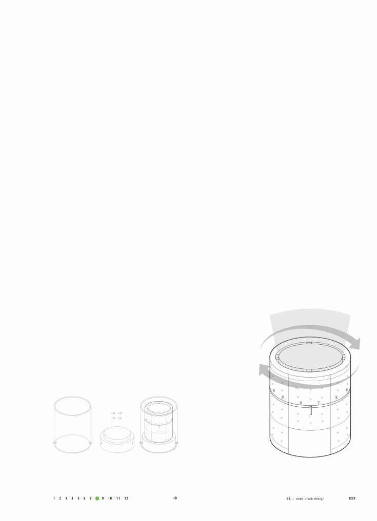
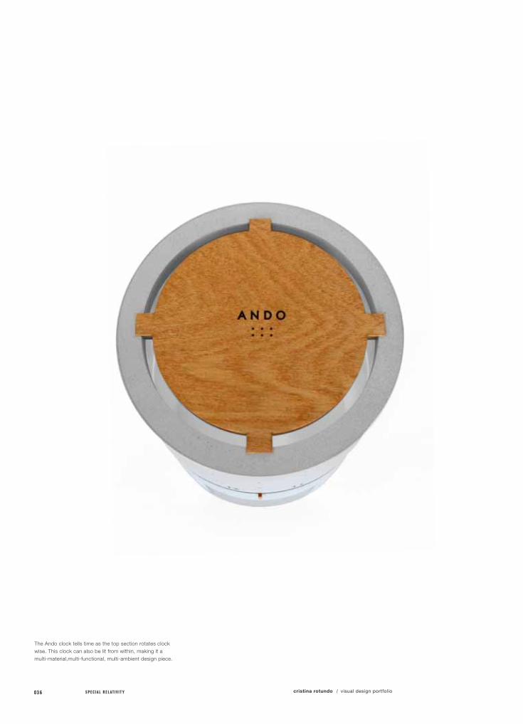
The Ando clock tells time as the top section rotates clock wise. This clock can also be lit from within, making it a multi-material,multi-functional, multi-ambient design piece.

1 2 3 4 5 6 7 8 9 10 11 12 0 3 702 . / ando clock des ign
038 S P E C I A L R E L A T I V I T Y cristina rotundo visual design portfolio/
project no. / objective /
solution /
field of reference /
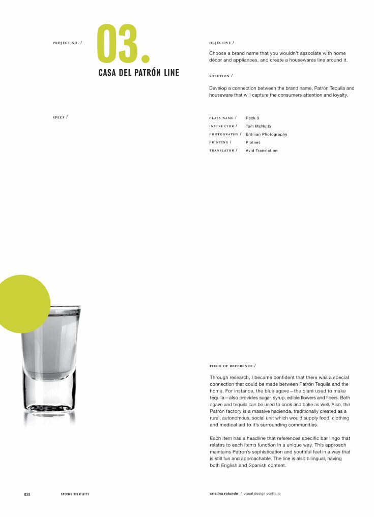
03.CASA dEL PATRÓn LInE
class name /
instructor /
photography /
printing /
translator /
Pack 3
Tom McNulty
Erdman Photography
Plotnet
Avid Translation
Choose a brand name that you wouldn’t associate with home décor and appliances, and create a housewares line around it.
Develop a connection between the brand name, Patrón Tequila and houseware that will capture the consumers attention and loyalty.
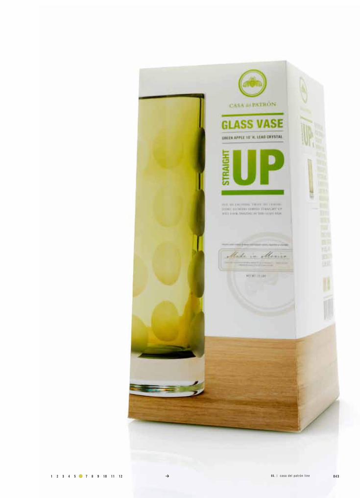
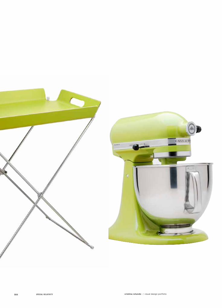
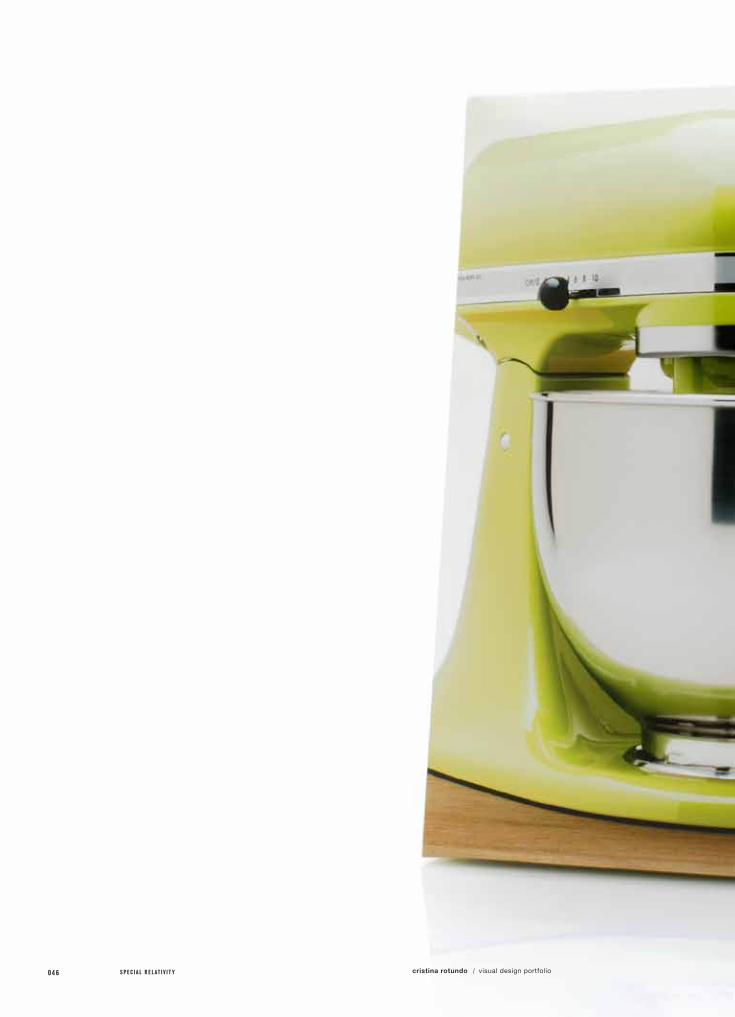
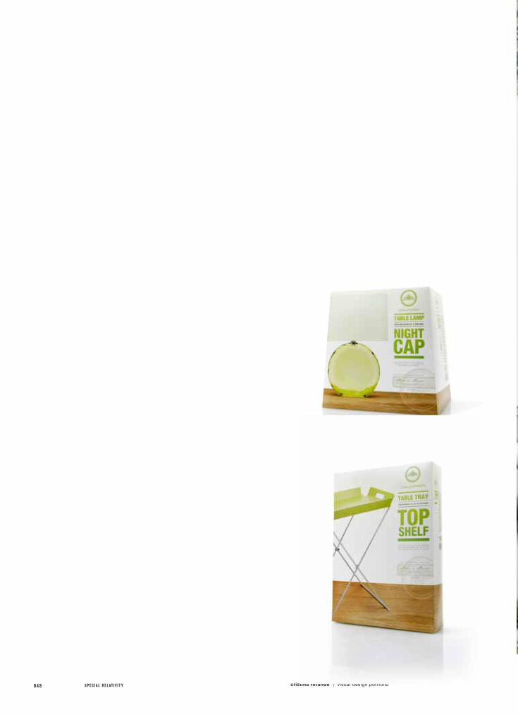
Through research, I became confident that there was a special connection that could be made between Patrón Tequila and the home. For instance, the blue agave—the plant used to make tequila—also provides sugar, syrup, edible flowers and fibers. Both agave and tequila can be used to cook and bake as well. Also, the Patrón factory is a massive hacienda, traditionally created as a rural, autonomous, social unit which would supply food, clothing and medical aid to it’s surrounding communities.
Each item has a headline that references specific bar lingo that relates to each items function in a unique way. This approach maintains Patron’s sophistication and youthful feel in a way that is still fun and approachable. The line is also bilingual, having both English and Spanish content.
specs /

1 2 3 4 5 6 7 8 9 10 11 12 0 3 9
a.)
b.)
specimens /
Logo
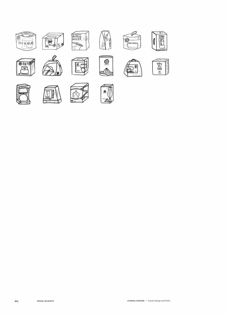
Packaging (5x)
03 . / casa de l pa t rón l ine

040 S P E C I A L R E L A T I V I T Y cristina rotundo visual design portfolio/

1 2 3 4 5 6 7 8 9 10 11 12 0 4 103 . / casa de l pa t rón l ine
042 S P E C I A L R E L A T I V I T Y cristina rotundo visual design portfolio/
1 2 3 4 5 6 7 8 9 10 11 12 0 4 303 . / casa de l pa t rón l ine
044 S P E C I A L R E L A T I V I T Y cristina rotundo visual design portfolio/

1 2 3 4 5 6 7 8 9 10 11 12 0 4 503 . / casa de l pa t rón l ine
046 S P E C I A L R E L A T I V I T Y cristina rotundo visual design portfolio/

1 2 3 4 5 6 7 8 9 10 11 12 0 4 703 . / casa de l pa t rón l ine
048 S P E C I A L R E L A T I V I T Y cristina rotundo visual design portfolio/

1 2 3 4 5 6 7 8 9 10 11 12 0 4 903 . / casa de l pa t rón l ine
050 S P E C I A L R E L A T I V I T Y cristina rotundo visual design portfolio/
project no. / objective /
solution /
field of reference /
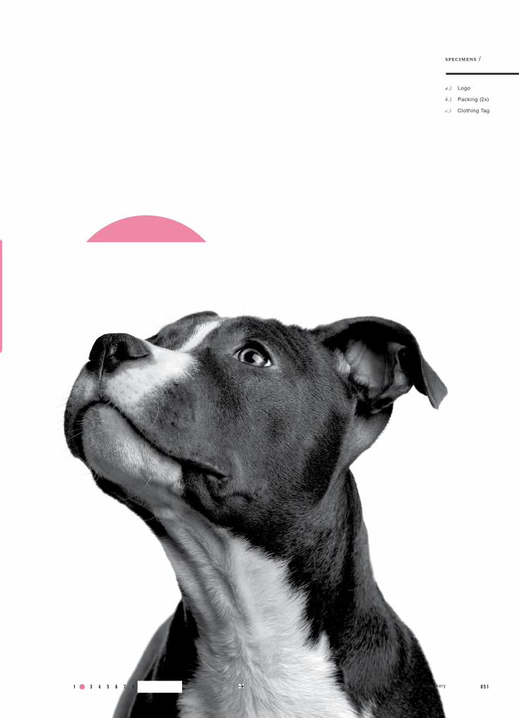
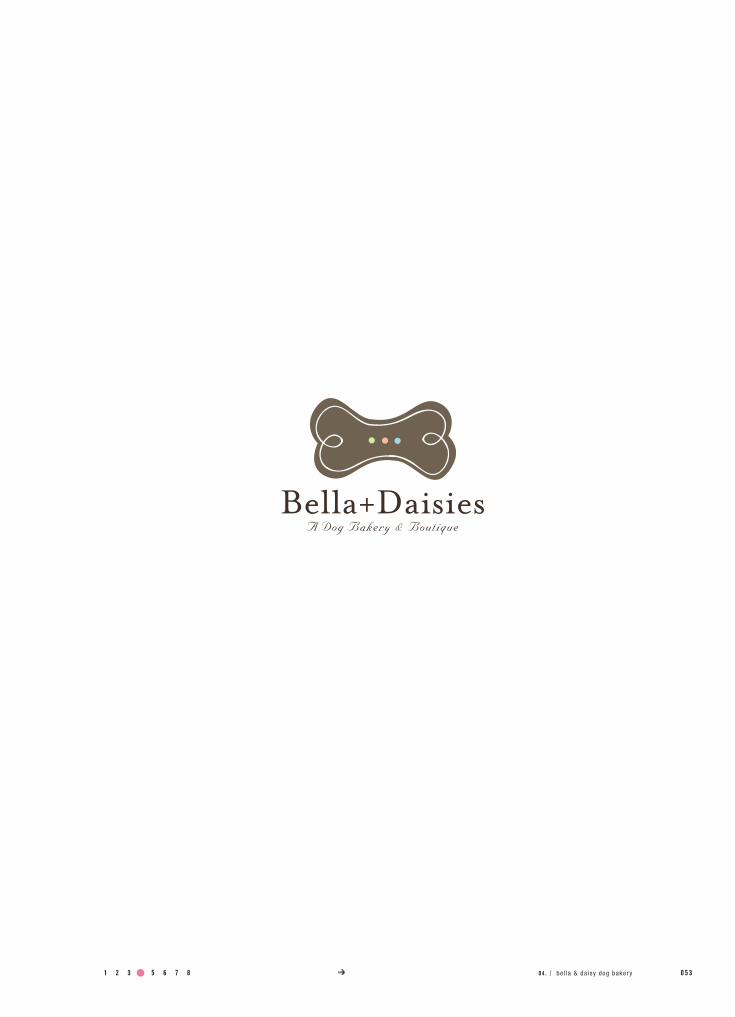
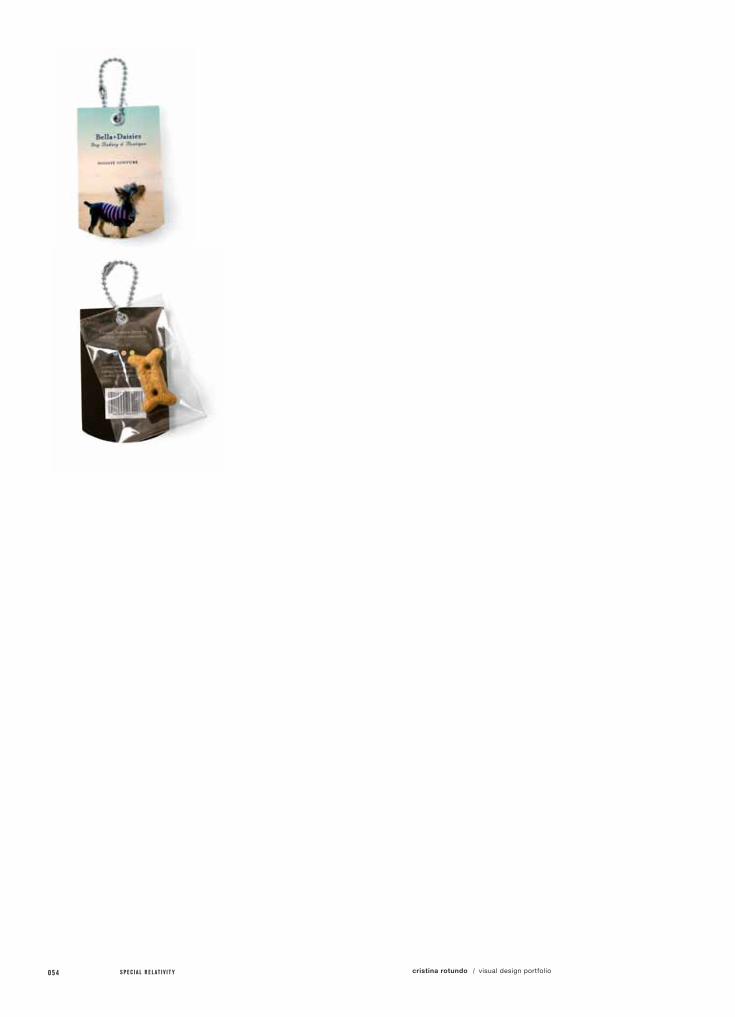
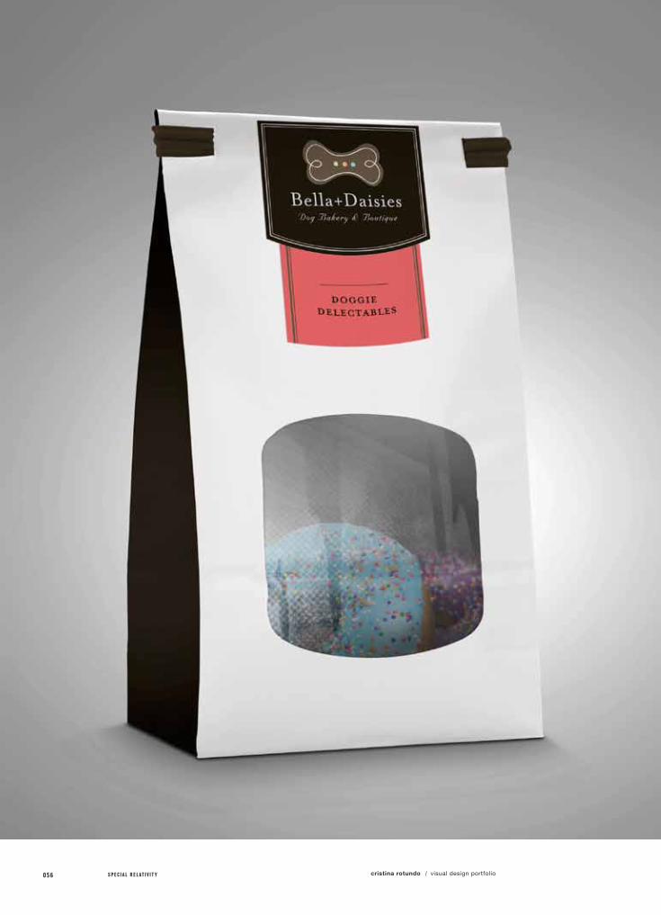
04.bELLA & dAISY dog bAKERY
class name /
instructor /
Pack 1
Coco Qiu
Choose a local brand of your choice and redesign their logo and develop a revitalized packaging system suited for their business.
Create a modern, chic shopping experience through a revitalized packaging system, while maintaining the locations core values.
Over the last several years, pet clothing and amenities have grown into a multi-million dollar industry as people have become more inclined to pamper their pets like they would pamper themselves. Bella & Daisy’s Dog Bakery and Boutique, have been offering local, San Franciscans a location where they can access a full range of exclusive products and amenities such as high-end collars, coats and sweaters, fashionable carriers, books, aroma-therapy, luxurious beds, and of course, their freshly baked treats ranging from savory to sweet, from bite-sized morsels to birthday cakes. All meticulously decorated to please your pet.
Unfortunately, their identity system lacks the luster needed to represent the experience they truly offer. This revised identity and packaging system has infused a sense of couture and delicatessens into this local, family owned business.
specs /
specimens /
Logo
Packing (2x)
Clothing Tag
a.)
b.)
c.)
1 2 3 4 5 6 7 8 9 10 11 12 0 5 104 . / be l la & da isy dog baker y

052 S P E C I A L R E L A T I V I T Y cristina rotundo visual design portfolio/
1 2 3 4 5 6 7 8 9 10 11 12 0 5 304 . / be l la & da isy dog baker y
054 S P E C I A L R E L A T I V I T Y cristina rotundo visual design portfolio/

1 2 3 4 5 6 7 8 9 10 11 12 0 5 504 . / be l la & da isy dog baker y
056 S P E C I A L R E L A T I V I T Y cristina rotundo visual design portfolio/
1 2 3 4 5 6 7 8 9 10 11 12 0 5 7
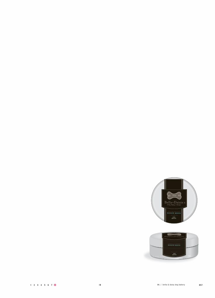
Bella+Daisie sA Dog Bakery & Boutique
doggie mints
100 mints
doggie mints
100 mints
04 . / be l la & da isy dog baker y

058 S P E C I A L R E L A T I V I T Y cristina rotundo visual design portfolio/
project no. / objective /
solution /
05.1A unInQuE InnoVATIon
class name /
instructor /
Graphic Design 2
Max Spector
Develop an imaginary invention that help make the world a better place and design a logo and brochure to advertise your invention.
Create a logo, stationery system and brochure that successfully informs and represents this innovation, the “Uninque Reprinter”.
specs /
field of reference /
Uninque Reprinter is home or office device which allows it’s owner to print and reprint on all new and used papers by clearing off all previously printed materials. This innovation can bring about a new revolution in how we can personally take control of our own paper waste and environmental foot print in a simple and effective way.
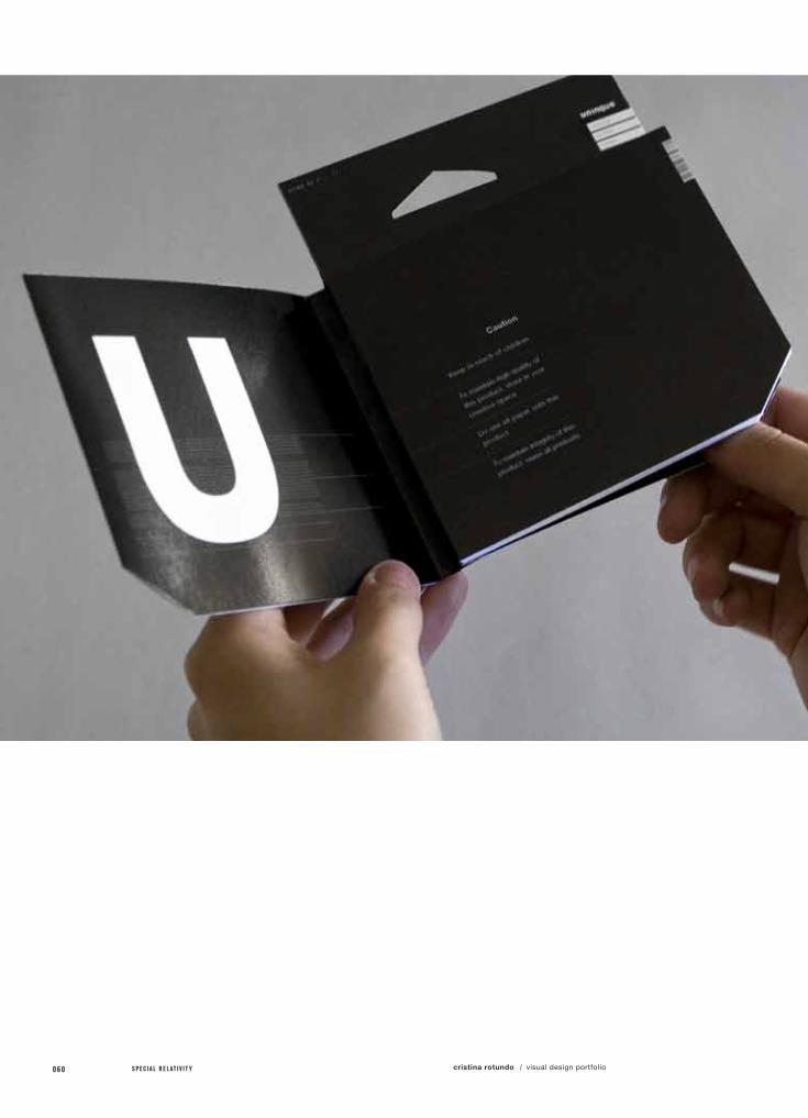
The logo is a simple and effective representation of this product. The “U” graphically shows ink rising of a surface to reveal a clean, white, reusable material underneath.
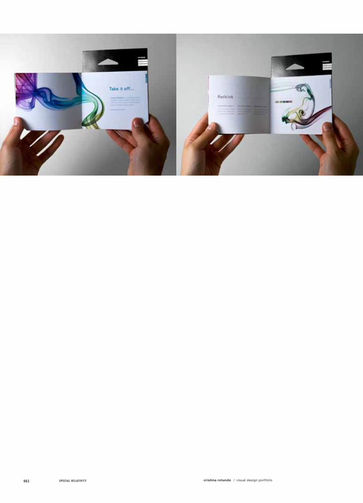
The brochure is designed to look like an ink cartridge package, which can be displayed among related competitor's products in a clever and enticing way. People will notice the slight similarity and will be attracted to learn about what it actually is.
1 2 3 4 5 6 7 8 9 10 11 12 0 5 9
specimens /
Logo
Brochure
Stationery System
a.)
b.)
c.)
05 .1 / a un inque innova t ion
060 S P E C I A L R E L A T I V I T Y cristina rotundo visual design portfolio/

1 2 3 4 5 6 7 8 9 10 11 12 0 6 105 .1 / a un inque innova t ion
062 S P E C I A L R E L A T I V I T Y cristina rotundo visual design portfolio/

1 2 3 4 5 6 7 8 9 10 11 12 0 6 305 .1 / a un inque innova t ion

064 S P E C I A L R E L A T I V I T Y cristina rotundo visual design portfolio/

1 2 3 4 5 6 7 8 9 10 11 12 0 6 505 .1 / a un inque innova t ion

066 S P E C I A L R E L A T I V I T Y cristina rotundo visual design portfolio/
project no. / objective /
solution /
05.2A unInQuE InVITATIon
class name /
instructor /
Graphic Design 2
Max Spector
Develop a promotional event for your innovation, sponsored by a paper company with event invitation, poster, and take-away gift.
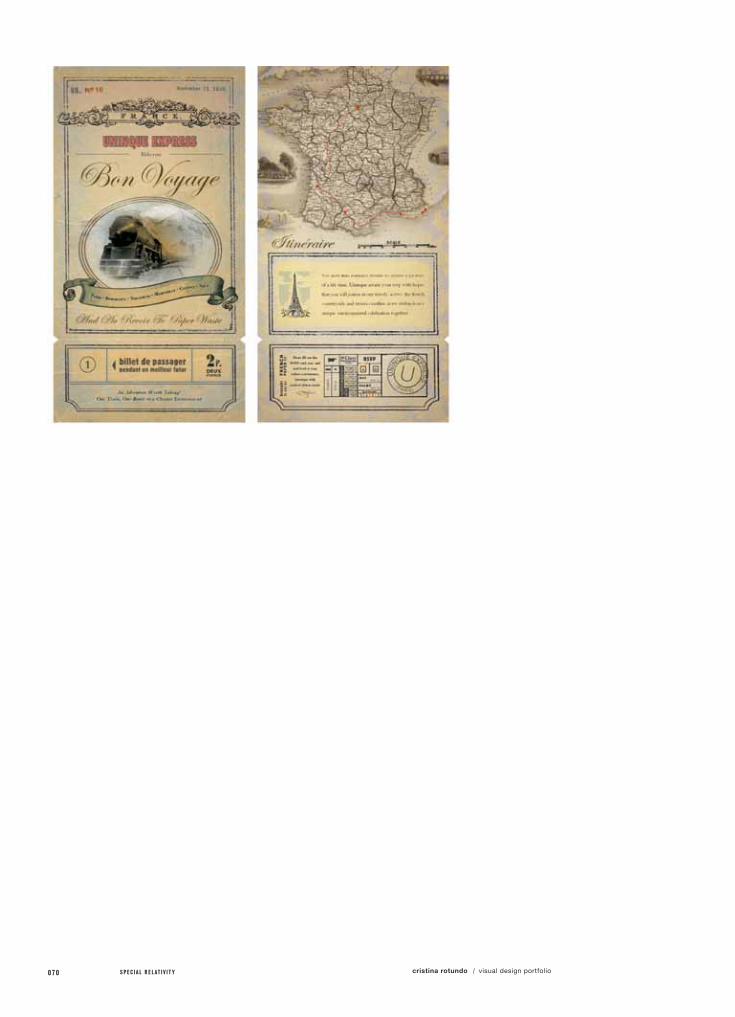
Sponsored by French Paper Company, created the event based around a train ride across the French country side with wine tours and tasting.
field of reference /
Because this innovation could be viewed as a threat to business for paper companies in general, I decided to choose the French Paper Company as my sponsor, due to the fact that they also have a wide variety of patterned, illustrated and decorative papers that represent the larger part of their identity and business. They will not have to worry about loosing money to Uninque’s capabilities. People will always need new decorative papers.
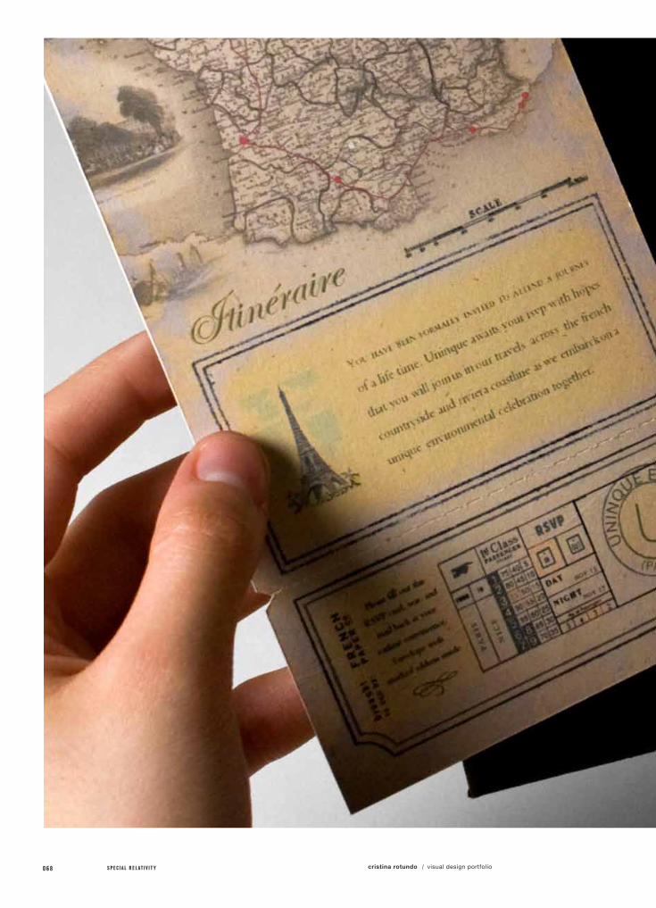
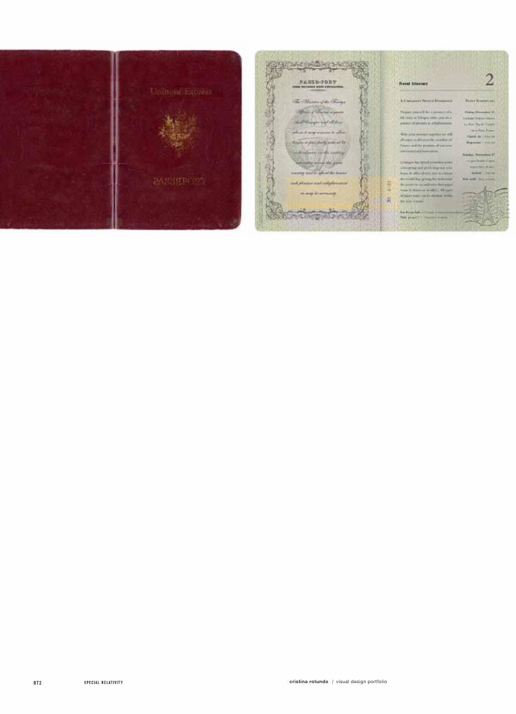
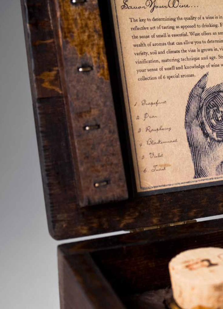
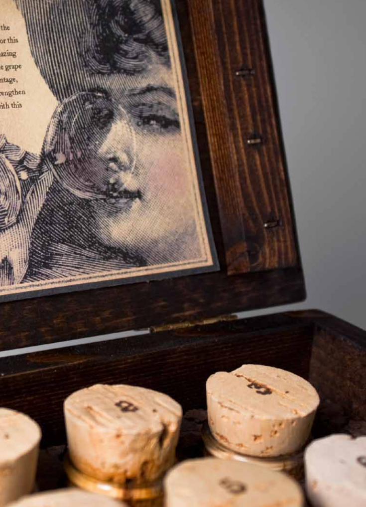
Even though the French Paper Company is not “French”, I thought I would base my promotional event around a unique train ride across the French country side. On this trip, people will get to learn about the Uninque Reprinter while enjoying scenic wine tasting and dining. People will receive a package that includes a passport with event info and a train ticket invitation. They will also be given a wine aroma kit take-away as a gift.
specs /

a.)
b.)
c.)
specimens /
Event Invitation
Event Poster
Event Take Away
1 2 3 4 5 6 7 8 9 10 11 12 0 6 705 .2 / a un inque inv i ta t ion
068 S P E C I A L R E L A T I V I T Y cristina rotundo visual design portfolio/

1 2 3 4 5 6 7 8 9 10 11 12 0 6 905 .2 / a un inque inv i ta t ion
070 S P E C I A L R E L A T I V I T Y cristina rotundo visual design portfolio/

1 2 3 4 5 6 7 8 9 10 11 12 0 7 105 .2 / a un inque inv i ta t ion
072 S P E C I A L R E L A T I V I T Y cristina rotundo visual design portfolio/

1 2 3 4 5 6 7 8 9 10 11 12 0 7 305 .2 / a un inque inv i ta t ion
074 S P E C I A L R E L A T I V I T Y cristina rotundo visual design portfolio/
1 2 3 4 5 6 7 8 9 10 11 12 0 7 5a uninque innovation /13 14 15 16
076 S P E C I A L R E L A T I V I T Y cristina rotundo visual design portfolio/
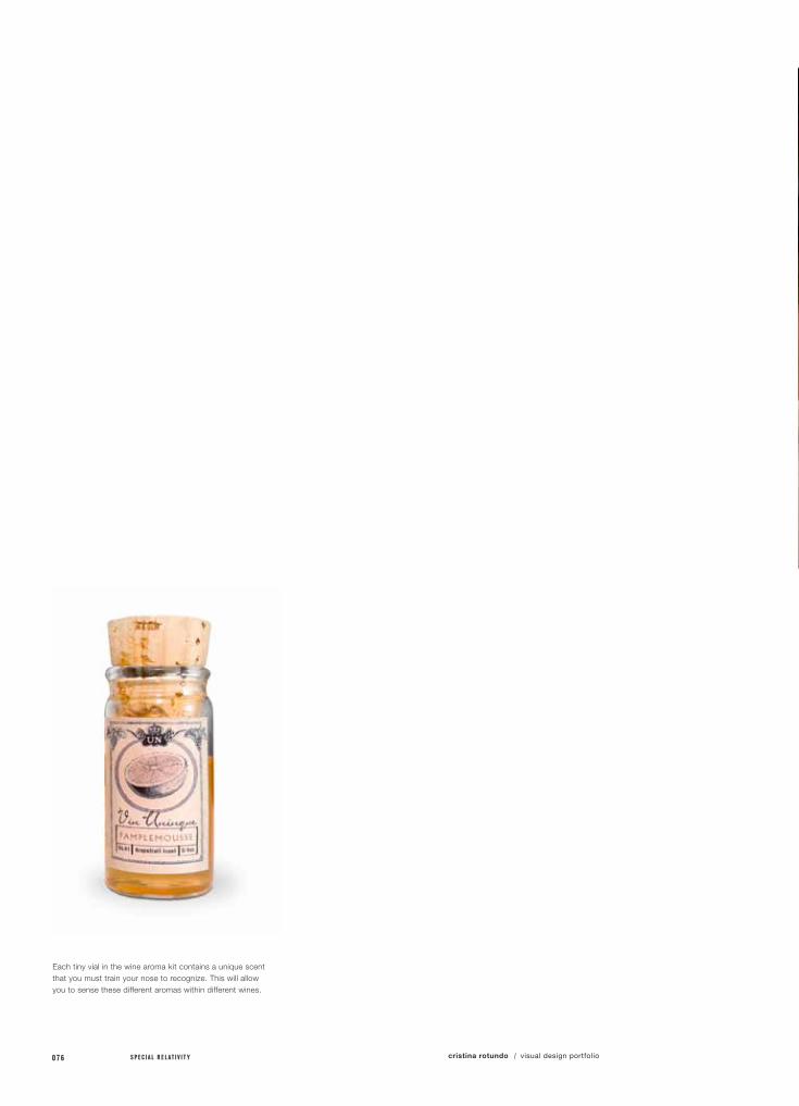
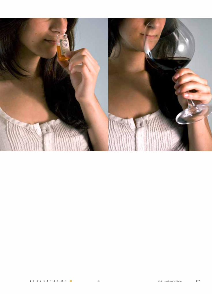
Each tiny vial in the wine aroma kit contains a unique scent that you must train your nose to recognize. This will allow you to sense these different aromas within different wines.
1 2 3 4 5 6 7 8 9 10 11 12 0 7 705 .2 / a un inque inv i ta t ion
078 S P E C I A L R E L A T I V I T Y cristina rotundo visual design portfolio/
project no. / objective /
solution /
field of reference /
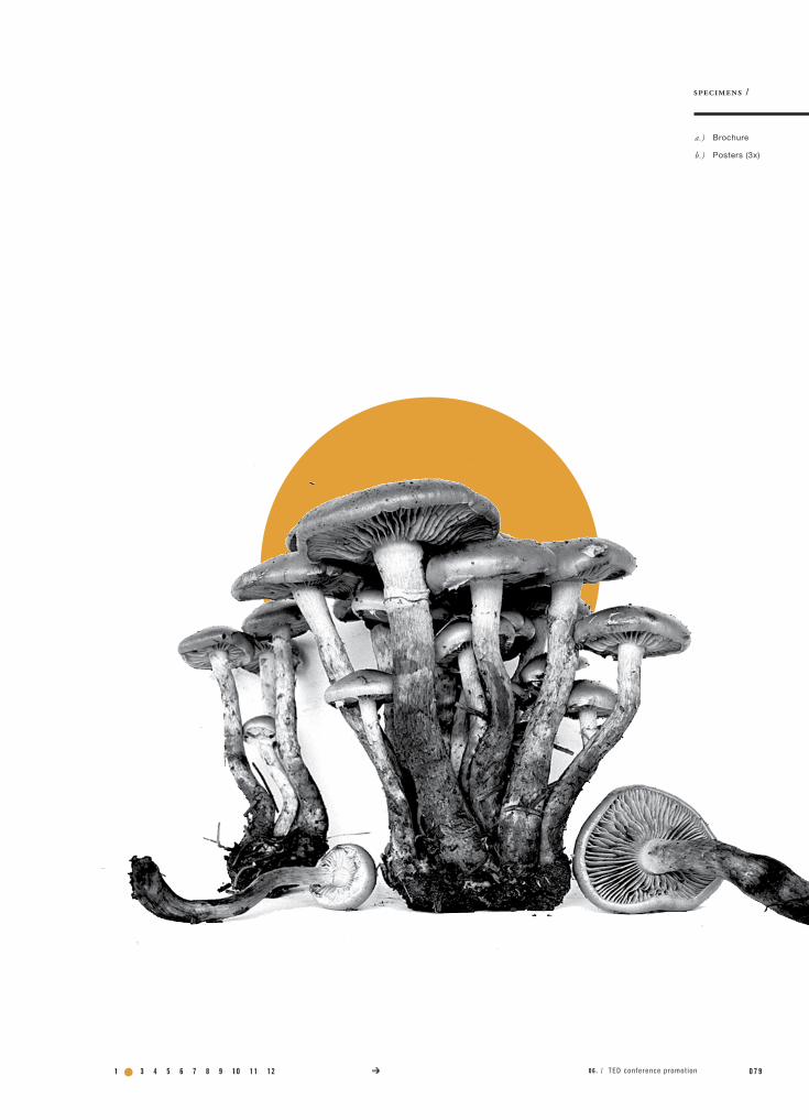
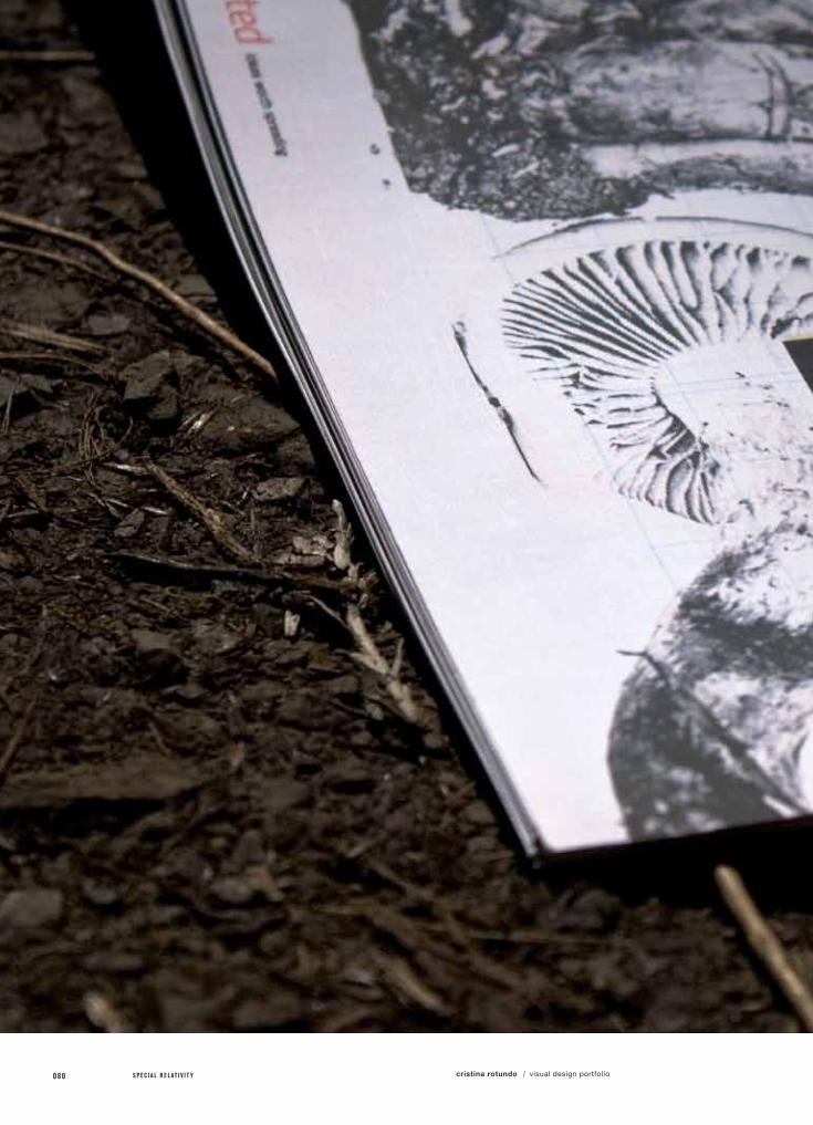
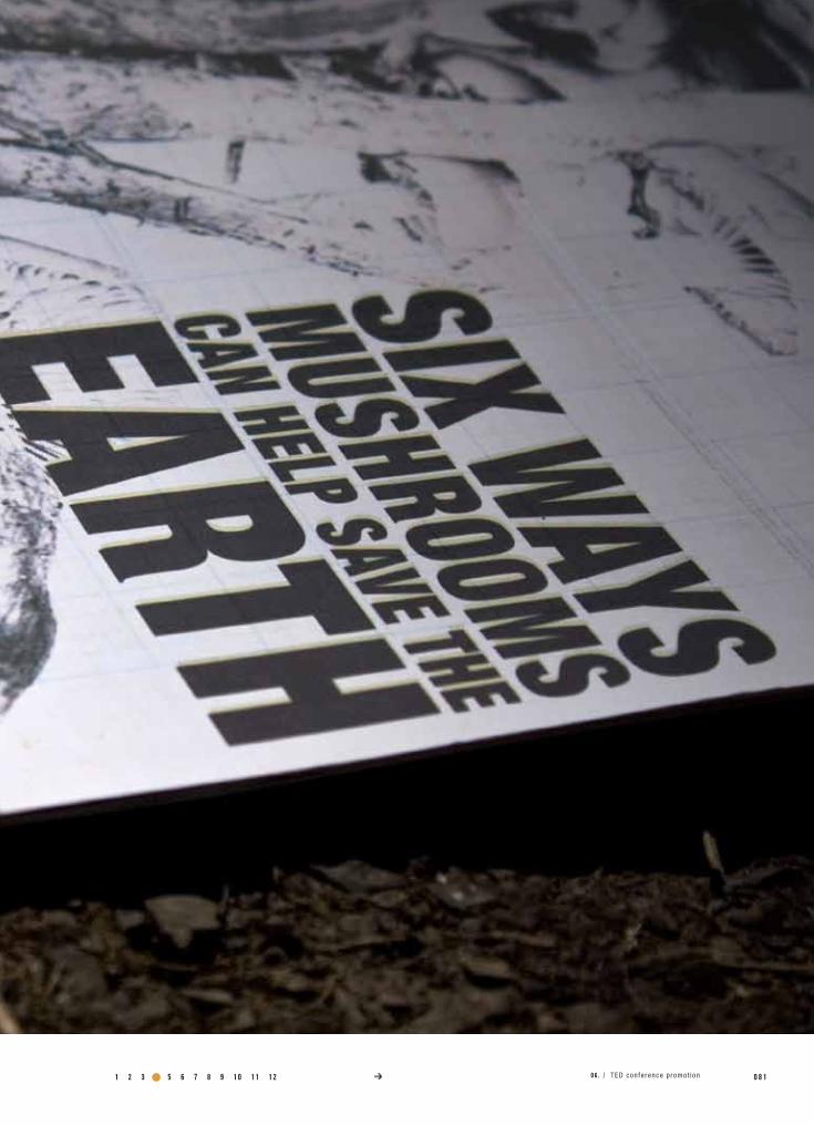
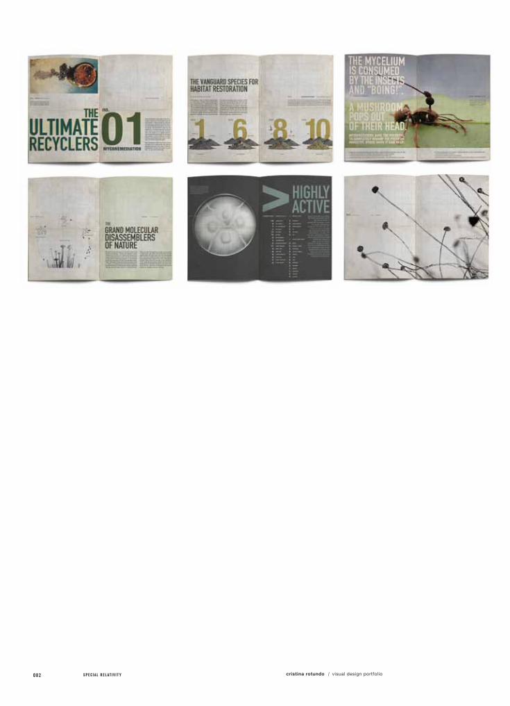
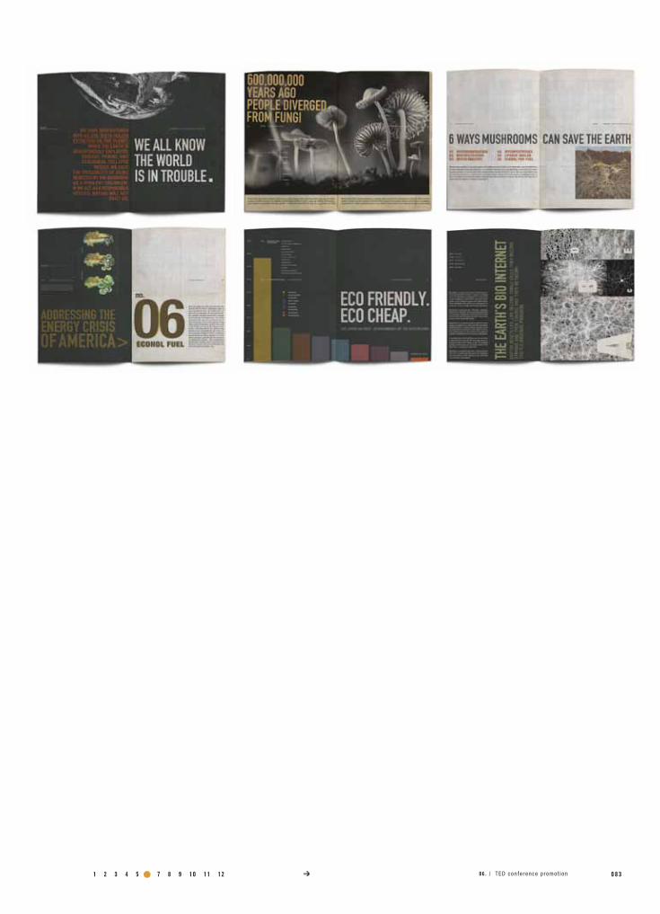
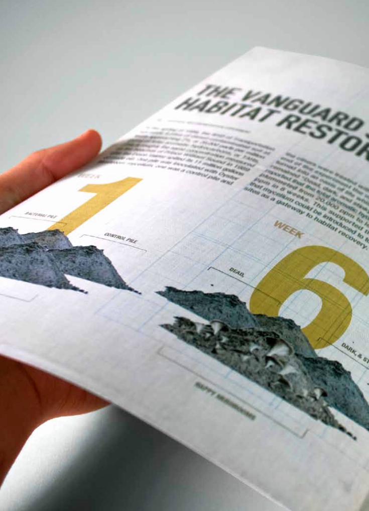
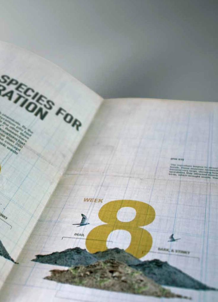
06.TEd ConfEREnCE bRoCHuRE
Select a TED Conference video of your choice and create a brochure and 3 posters promoting the importance of this talk.
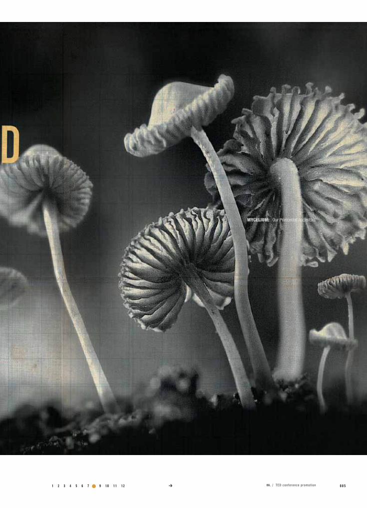
Focus on creating strong, comprehensive, information graphics and imagery to best communicate Paul Stamet’s mycelium research.
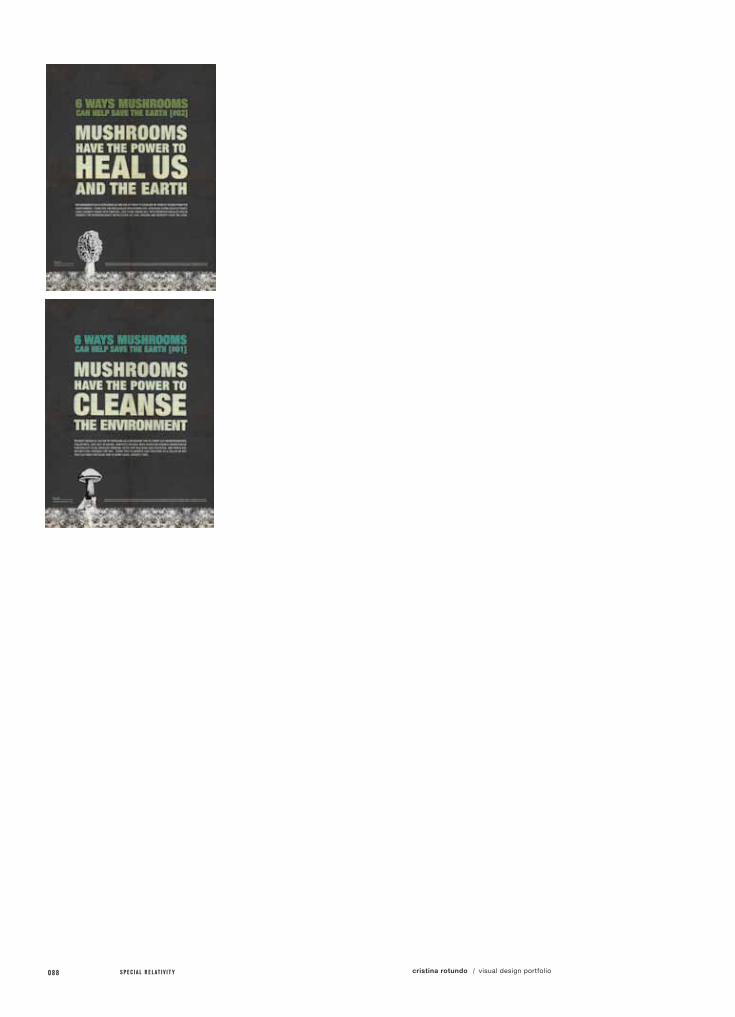
For this assignment, I was to research a TED video clip and came across the video, “6 Ways Mushrooms Can Help Save the Earth”, by Paul Stamets and was hooked by the message immediately. I will never look at mushrooms the same way again!
The focus of mycologist, Paul Stamets’ research is the northwest’s native fungal genome, mycelium. The activities of mycelium help heal and steer ecosystems on their evolutionary path, cycling nutrients through the food chain. Fungi are keystone species that create ever thickening layers of soils, which allow future plant and animal generations to flourish. Without fungi, all of the earth’s ecosystems would fail. He believes that mushrooms can save our lives, restore our ecosystems and transform other worlds. In this brochure, I attempt to promote and communicate his message through strong info graphics and iconic imagery.
class name /
instructor /
Print 2
Megumi Kiyama
specs /
1 2 3 4 5 6 7 8 9 10 11 12 0 7 906 . / TED conference promot ion
a.)
b.)
specimens /
Brochure
Posters (3x)
080 S P E C I A L R E L A T I V I T Y cristina rotundo visual design portfolio/
1 2 3 4 5 6 7 8 9 10 11 12 0 8 106 . / TED conference promot ion
082 S P E C I A L R E L A T I V I T Y cristina rotundo visual design portfolio/
1 2 3 4 5 6 7 8 9 10 11 12 0 8 306 . / TED conference promot ion

084 S P E C I A L R E L A T I V I T Y cristina rotundo visual design portfolio/
1 2 3 4 5 6 7 8 9 10 11 12 0 8 506 . / TED conference promot ion
086 S P E C I A L R E L A T I V I T Y cristina rotundo visual design portfolio/
1 2 3 4 5 6 7 8 9 10 11 12 0 8 7ted conference promotion/
088 S P E C I A L R E L A T I V I T Y cristina rotundo visual design portfolio/

1 2 3 4 5 6 7 8 9 10 11 12 0 8 906 . / TED conference promot ion
090 S P E C I A L R E L A T I V I T Y cristina rotundo visual design portfolio/
project no. / objective /
solution /
field of reference /
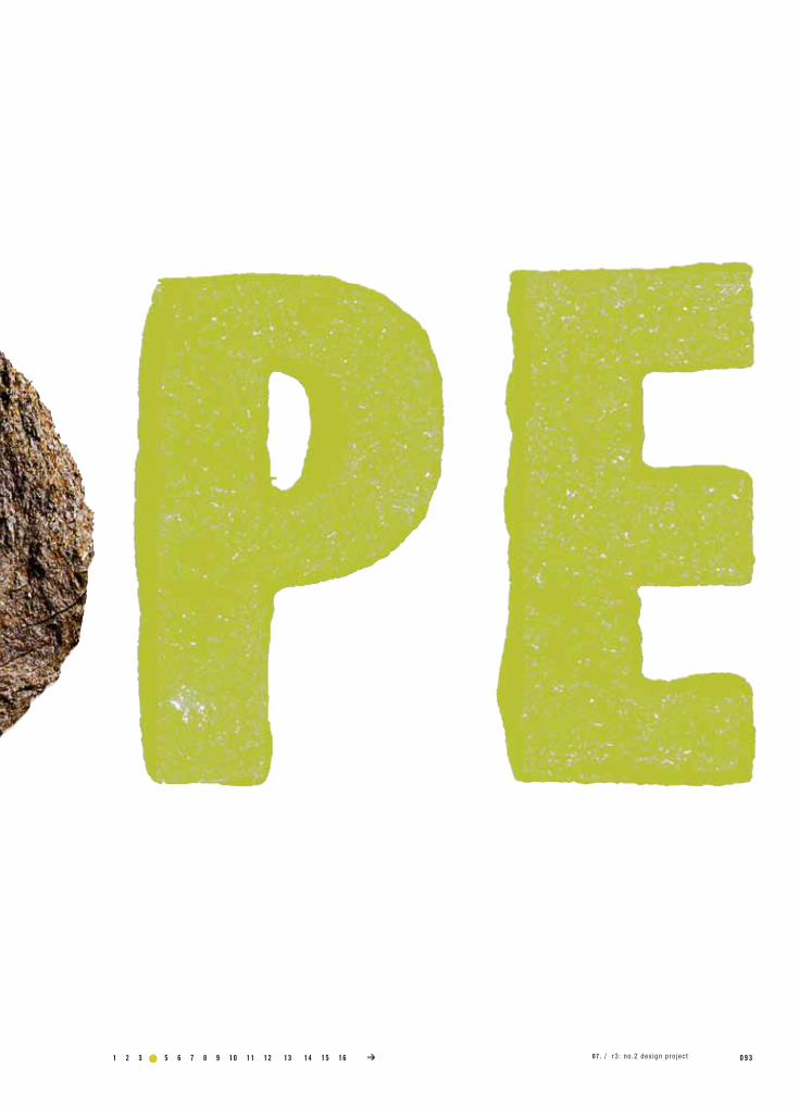
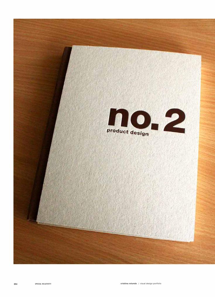
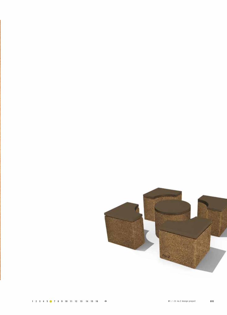
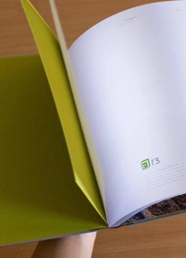
07.R3: no.2 dESIgn PRojECT
Consider a product you would use daily or purchase regularly and rethink how the product could be redesigned to be more eco-friendly.
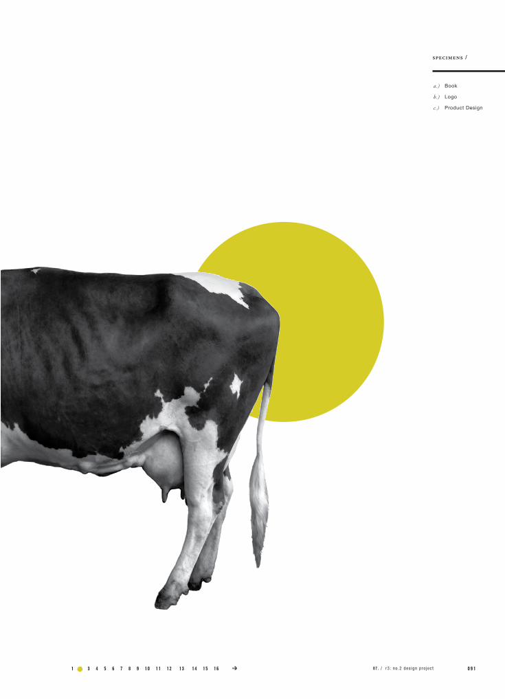
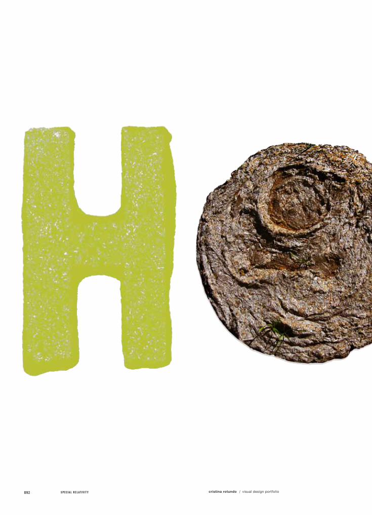
Consider manure as a abundant material that can be pressed into clean, functional, modern furniture with a cradle to cradle lifecycle.
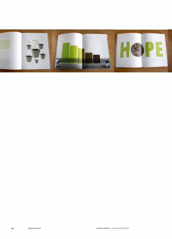
I was inspired by a product called the cow pot, which is a plant pot made from pressed manure. I considered other ways to utilize this method and thought, why not manufacture furniture this way, similar to cork, or wood chips.
This furniture would be cleaner and safer to have in your home than most furniture people currently own. It is durable, local and modern and can essentially be thrown away into your garden when it has reached the end of it's life span.
The pressed material is the by-product of manure being heated and broken down for methane production. So, besides being a method of offsetting the effects of mass cattle ranching on the environment, it also encourages the use of alternative energy.
class name /
instructor /
printer /
book binder /
Print 4
Tom Sieu
H&H Imaging
The Key Bindery
specs /
1 2 3 4 5 6 7 8 9 10 11 12 0 9 1
a.)
b.)
c.)
specimens /
Book
Logo
Product Design
07 . / r3 : no .2 des ign pro jec t13 14 15 16
092 S P E C I A L R E L A T I V I T Y cristina rotundo visual design portfolio/
1 2 3 4 5 6 7 8 9 10 11 12 0 9 307 . / r3 : no .2 des ign pro jec t13 14 15 16
094 S P E C I A L R E L A T I V I T Y cristina rotundo visual design portfolio/
1 2 3 4 5 6 7 8 9 10 11 12 0 9 507 . / r3 : no .2 des ign pro jec t13 14 15 16
096 S P E C I A L R E L A T I V I T Y cristina rotundo visual design portfolio/

1 2 3 4 5 6 7 8 9 10 11 12 0 9 7r3: no.2 design project/
098 S P E C I A L R E L A T I V I T Y cristina rotundo visual design portfolio/

1 2 3 4 5 6 7 8 9 10 11 12 0 9 907 . / r3 : no .2 des ign pro jec t13 14
1 0 0 S P E C I A L R E L A T I V I T Y cristina rotundo visual design portfolio/
+
BIOGAS ZONE
WASTE INFLOW
MIXER
WASTE OUTFLOW
GAS OUTFLOW
SLURRY PIPE
LIQUID ZONE
SLURRY ZONE
MIXING ZONE
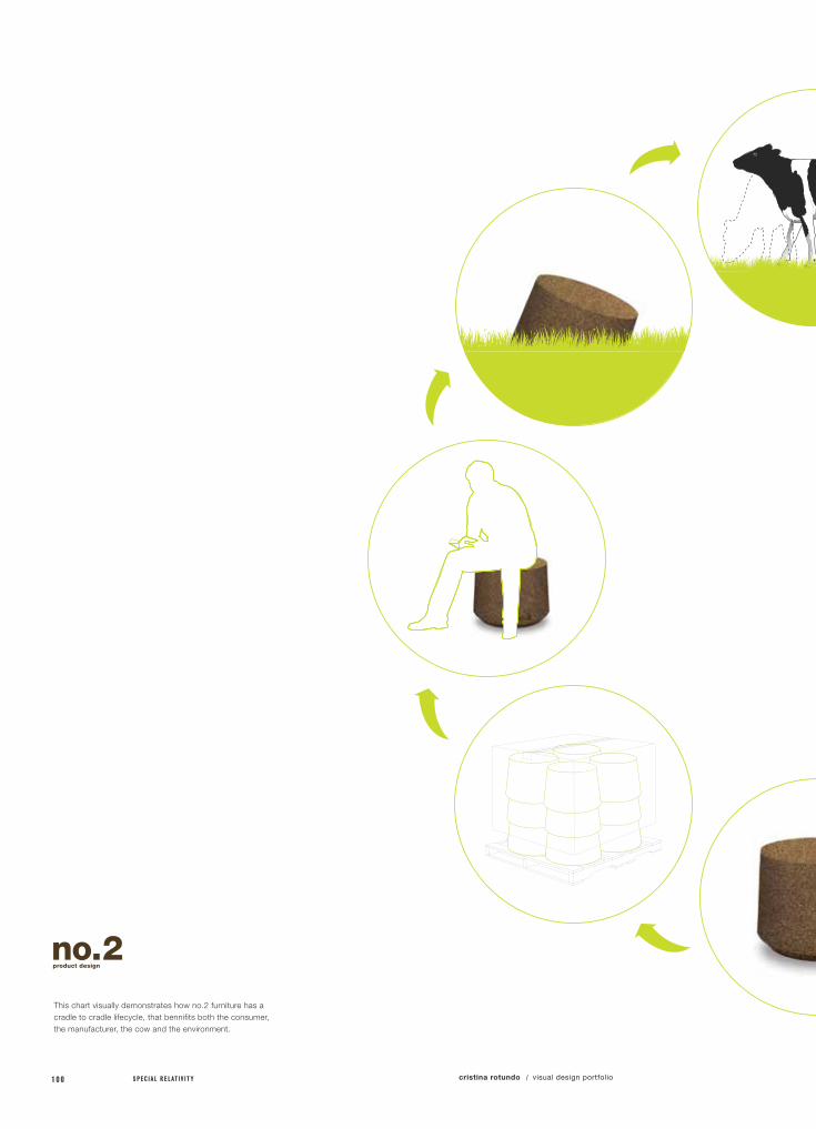
This chart visually demonstrates how no.2 furniture has a cradle to cradle lifecycle, that bennifits both the consumer, the manufacturer, the cow and the environment.

1 2 3 4 5 6 7 8 9 10 11 12 1 0 1
+
BIOGAS ZONE
WASTE INFLOW
MIXER
WASTE OUTFLOW
GAS OUTFLOW
SLURRY PIPE
LIQUID ZONE
SLURRY ZONE
MIXING ZONE
13 14 15 16 07 . / r3 : no .2 des ign pro jec t

1 0 2 S P E C I A L R E L A T I V I T Y cristina rotundo visual design portfolio/
1 2 3 4 5 6 7 8 9 10 11 12 1 0 313 14 15 16 07 . / r3 : no .2 des ign pro jec t

1 0 4 S P E C I A L R E L A T I V I T Y
project no. / objective /
solution /
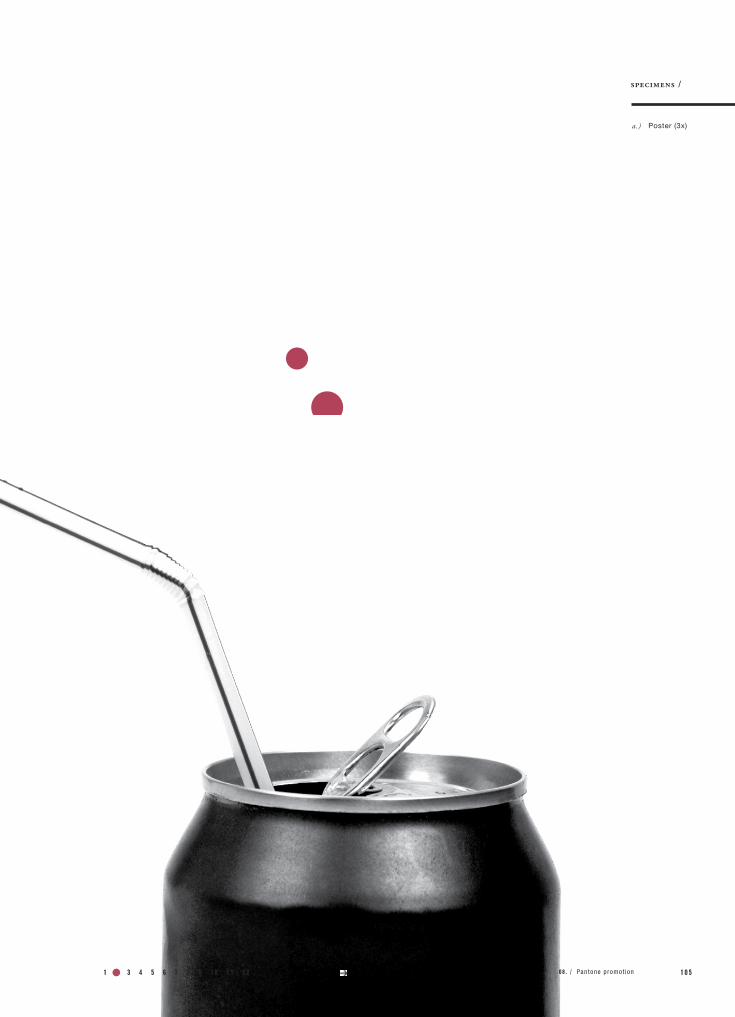
08.PAnTonE PRomoTIon
Design a unique promotional poster series of 3 for Pantone using a limited color pallet of Pantone colors to showcase color quality.
Create 3 colorful characters that represent sweets based around a Japanese inspired advertising esthetic and vector illustration style.
class name /
instructor /
printer /
Print 2
Megumi Kiyama
Plotnet
specs /
field of reference /
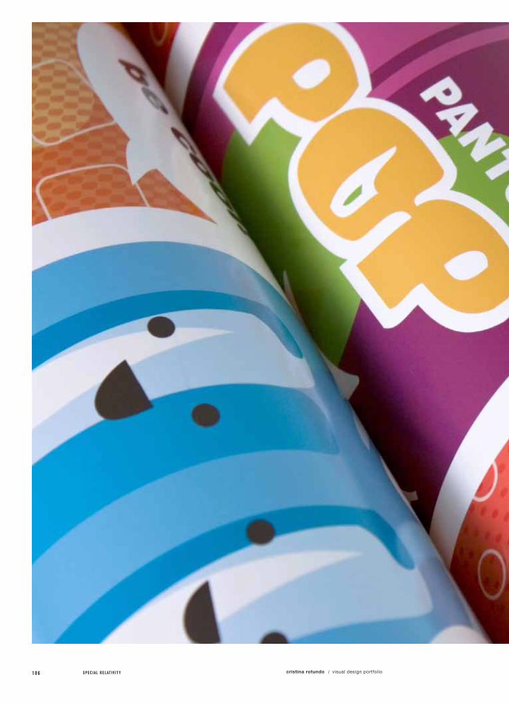
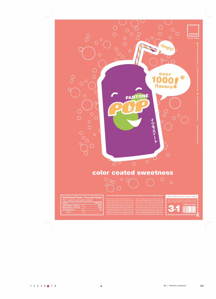
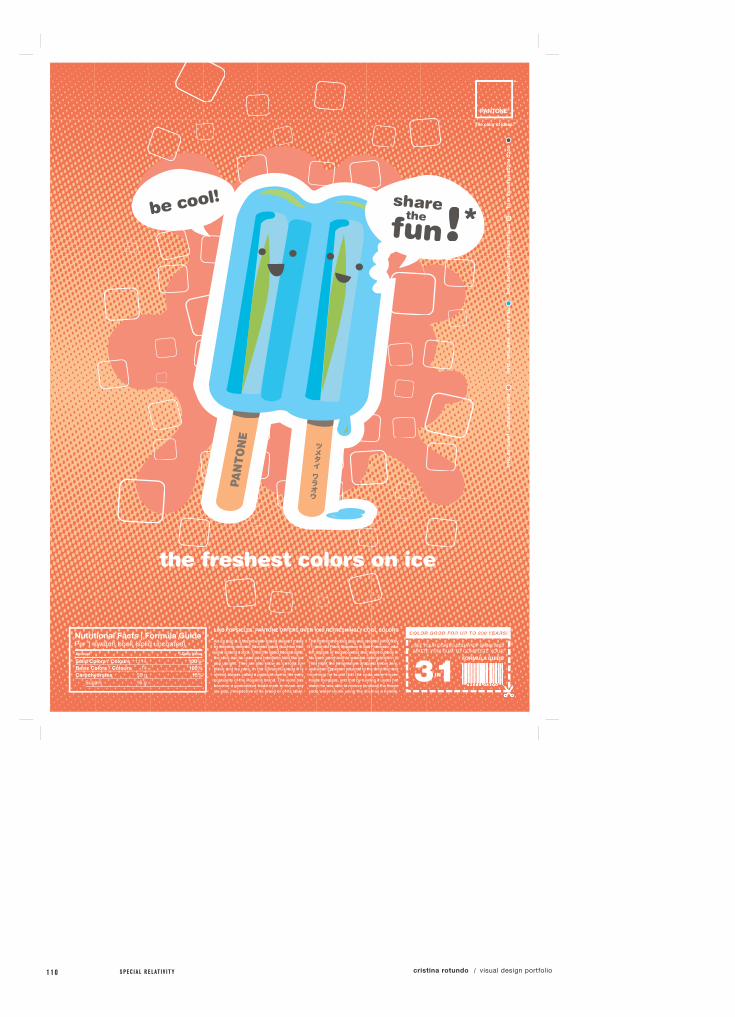
The Pantone matching system (PMS), is the definitive international reference for selecting, specifying, matching and controlling ink colors. The idea behind the PMS is to allow designers to ‘color match’ specific colors when a design enters production stage.
The purpose of this promotional poster series is to showcase the quality, vibrance and the possibilities available to you when using Pantone. Inspiration that came to mind that reminded me of multi-colored, vibrance was the packaging of sweets and Japanese advertising esthetics and illustration styles. The 3 characters I chose to create are based around these inspirations and are meant to make a connection between how flavorful and powerful Pantone colors can be, and the endless creative possibilities they offer.
cristina rotundo visual design portfolio/
a.)
specimens /
Poster (3x)
1 2 3 4 5 6 7 8 9 10 11 12 1 0 508 . / Pantone promot ion
1 0 6 S P E C I A L R E L A T I V I T Y cristina rotundo visual design portfolio/

1 2 3 4 5 6 7 8 9 10 11 12 1 0 708 . / Pantone promot ion

1 0 8 S P E C I A L R E L A T I V I T Y cristina rotundo visual design portfolio/
1 2 3 4 5 6 7 8 9 10 11 12 1 0 908 . / Pantone promot ion
1 1 0 S P E C I A L R E L A T I V I T Y cristina rotundo visual design portfolio/

1 2 3 4 5 6 7 8 9 10 11 12 1 1 108 . / Pantone promot ion
1 1 2 S P E C I A L R E L A T I V I T Y cristina rotundo visual design portfolio/
project no. / objective /
solution /
field of reference /
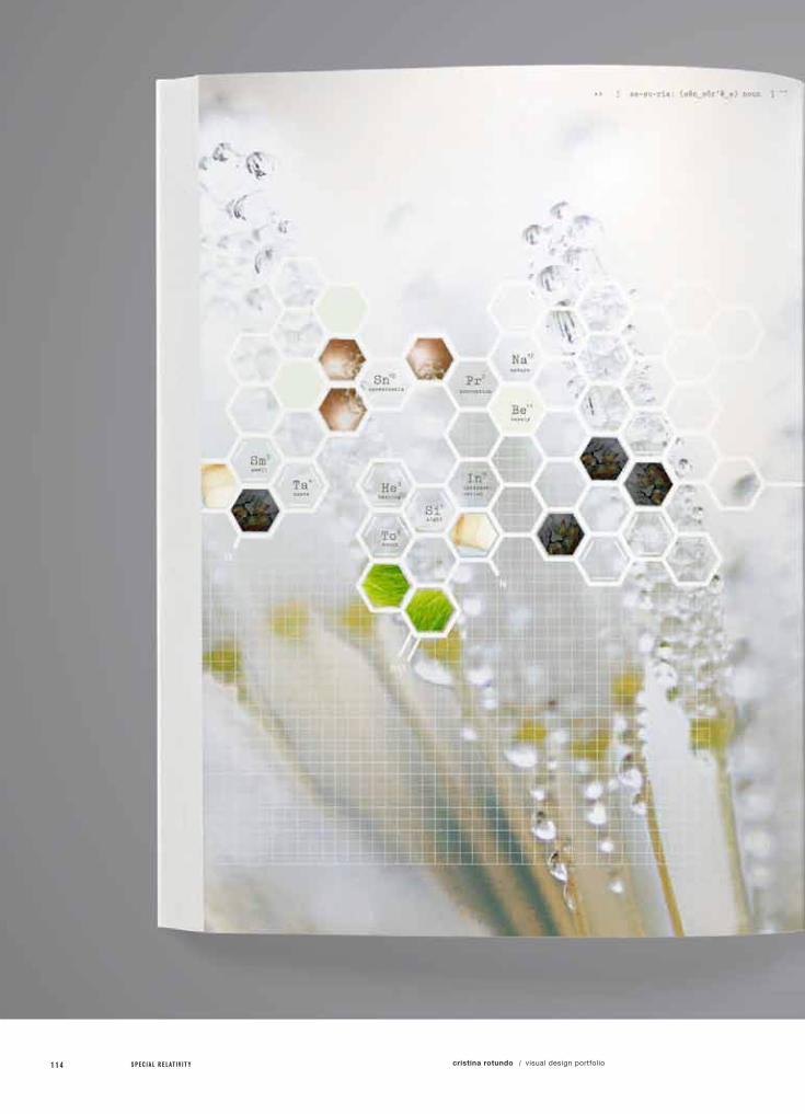
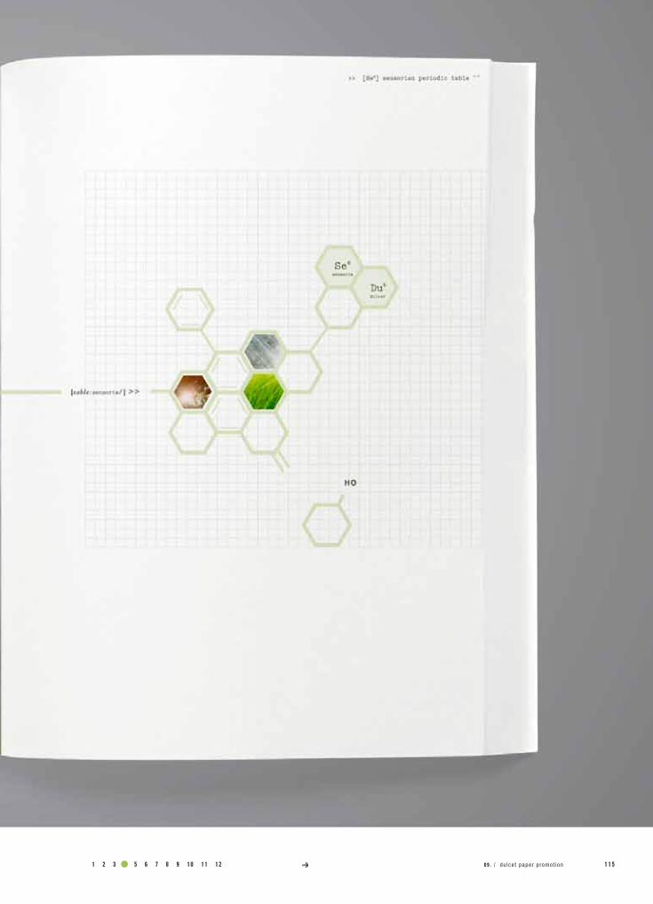
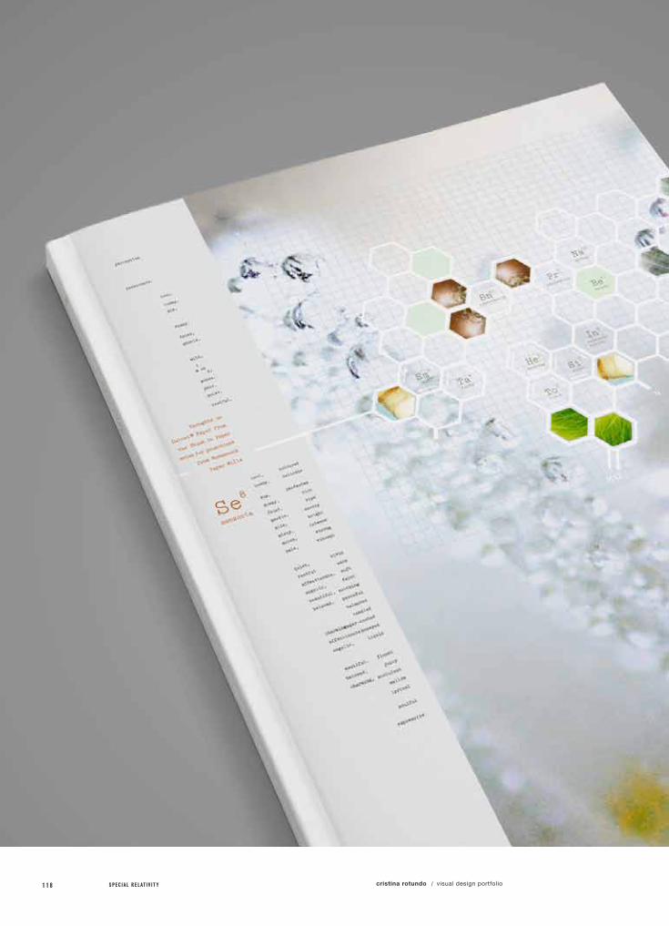
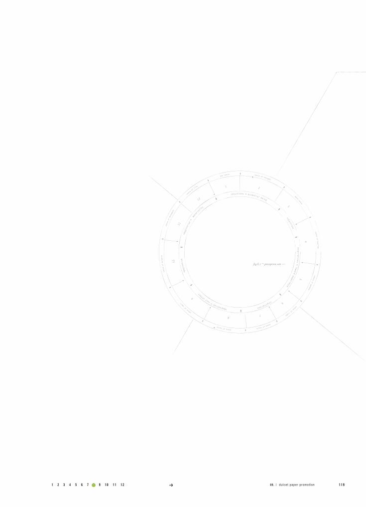
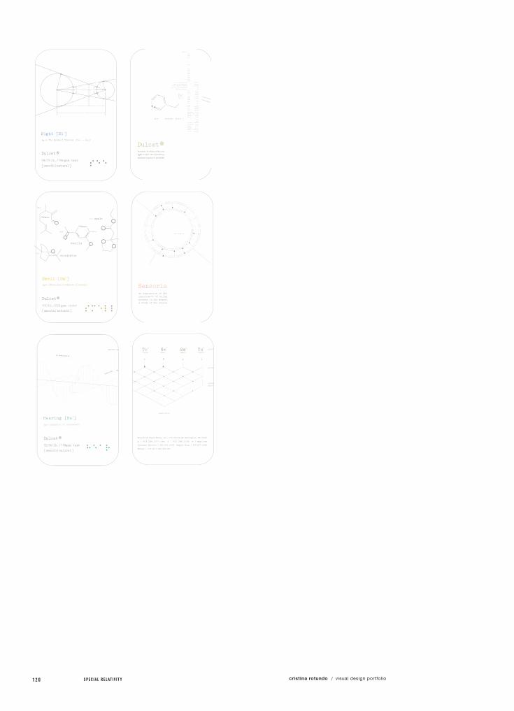
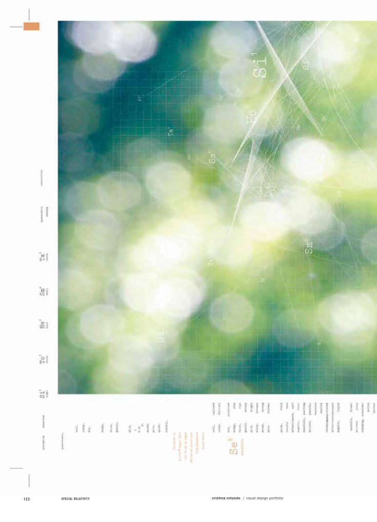
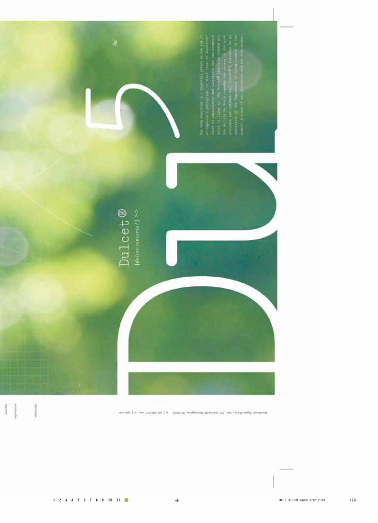
09.duLCET PAPER PRomoTIon
Choose a paper line and create a booklet advertising the qualities and uniqueness of the paper through a visual story or info and graphics.
Create a visual story around the Dulcet Paper line and the definition of "Sensoria" and how they relate to eachother.
Sensoria”, is the title of the promotional booklet I developed to showcase the Dulcet Paper Line in a more involved and abstract way. The word dulcet is an adjective that describes something that is pleasing to the senses. The word sensoria seemed to be the perfect title for the book, setting the stage for how I would develop the content. The term sensorium [plural: sensoria] refers to the sum of an organism’s perception, or, the “seat of sensation”, where it experiences and interprets the environments within which it lives. These include the sensation, perception, and interpretation of information about the world by senses and perceptual systems.
“Sensoria”, is an expression of the importance of being present in the moment. It is an exploration of our perception of what is naturally beautiful and an examination of the five senses. Dulcet paper line can be the vehicle for this heightened appreciation to be experienced through print.
class name /
instructor /
Typography 3
Ariel Grey
specs /
“

1 2 3 4 5 6 7 8 9 10 11 12 1 1 3
a.)
b.)
c.)
specimens /
Book
Poster
Promotional Item
09 . / dulcet paper promot ion
1 1 4 S P E C I A L R E L A T I V I T Y cristina rotundo visual design portfolio/
1 2 3 4 5 6 7 8 9 10 11 12 1 1 509 . / dulcet paper promot ion
1 1 6 S P E C I A L R E L A T I V I T Y cristina rotundo visual design portfolio/

1 2 3 4 5 6 7 8 9 10 11 12 1 1 709 . / dulcet paper promot ion
1 1 8 S P E C I A L R E L A T I V I T Y cristina rotundo visual design portfolio/
1 2 3 4 5 6 7 8 9 10 11 12 1 1 909 . / dulcet paper promot ion
1 2 0 S P E C I A L R E L A T I V I T Y cristina rotundo visual design portfolio/

1 2 3 4 5 6 7 8 9 10 11 12 1 2 109 . / dulcet paper promot ion
1 2 2 S P E C I A L R E L A T I V I T Y cristina rotundo visual design portfolio/
1 2 3 4 5 6 7 8 9 10 11 12 1 2 309 . / dulcet paper promot ion
1 2 4 S P E C I A L R E L A T I V I T Y cristina rotundo visual design portfolio/
project no. / objective /
solution /
field of reference /
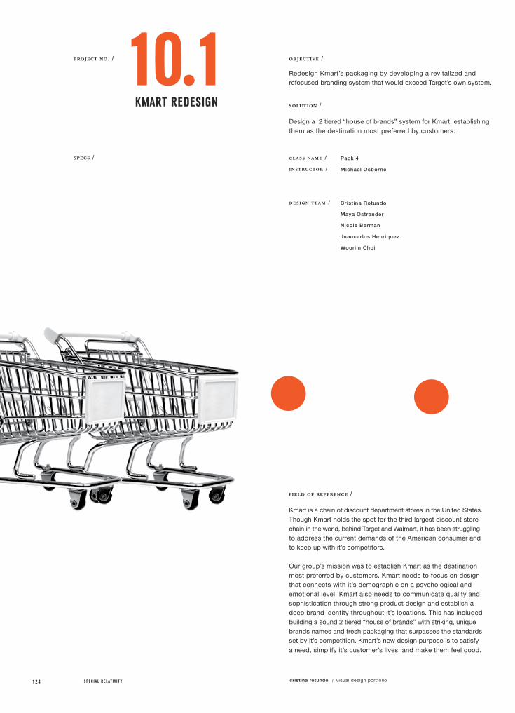
10.1KmART REdESIgn
Redesign Kmart’s packaging by developing a revitalized and refocused branding system that would exceed Target’s own system.
Design a 2 tiered “house of brands” system for Kmart, establishing them as the destination most preferred by customers.
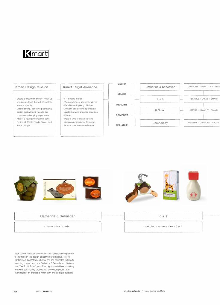
Kmart is a chain of discount department stores in the United States. Though Kmart holds the spot for the third largest discount store chain in the world, behind Target and Walmart, it has been struggling to address the current demands of the American consumer and to keep up with it’s competitors.
Our group’s mission was to establish Kmart as the destination most preferred by customers. Kmart needs to focus on design that connects with it’s demographic on a psychological and emotional level. Kmart also needs to communicate quality and sophistication through strong product design and establish a deep brand identity throughout it’s locations. This has included building a sound 2 tiered “house of brands” with striking, unique brands names and fresh packaging that surpasses the standards set by it’s competition. Kmart’s new design purpose is to satisfy a need, simplify it’s customer’s lives, and make them feel good.
class name /
instructor /
design team /
Pack 4
Michael Osborne
Cristina Rotundo
Maya Ostrander
Nicole Berman
Juancarlos Henriquez
Woorim Choi
specs /
1 2 3 4 5 6 7 8 9 10 11 12 1 2 5
a.)
b.)
specimens /
Logos (5x)
Packaging lines (4x)
10 .1 / kmar t redes ign
1 2 6 S P E C I A L R E L A T I V I T Y cristina rotundo visual design portfolio/
Catherine & Sebastian c + s K Soleil Serendipity
· home · food · pets · clothing · accessories · food · food · pets · home · body · bath · beauty
Each tier will reflect an element of Kmart's history brought back to life through the design objectives listed above. Tier 1: “Catherine & Sebastian”, a higher end line dedicated to kmart’s founding couple, and c+s, Catherine & Sebastian’s children’s line. Tier 2: “K Soleil”, our Blue Light special line providing everyday, eco friendly products at affordable prices, and “Serendipity”, an affordable Kmart bath and body products line.
Kmart Design Mission
· Create a “House of Brands” made up
of 4 private lines that will strengthen
Kmart’s identity
· Create strong, cohesive packaging
design that will add value to the
consumers shopping experience
· Attract a younger consumer base
· Fusion of Whole Foods, Target and
Anthropologie
Kmart Target Audience
· 8-45 years of age
· Young women / Mothers / Wives
· Families with young children
· Affluent people who appreciate
quality but who are price concious
· Ethnic
· People who want a one stop
shopping experience for name
brands that are cost effective
VALUECatherine & Sebastian
c + s
K Soleil
Serendipity
SMART
TIER 1 TIER 1 TIER 2 TIER 2
HEALTHY
COMFORT
RELIABLE
Catherine & Sebastian c + s K Soleil SerendipityCOMFORT + SMART + RELIABLE
RELIABLE + VALUE + SMART
SMART + HEALTHY + VALUE
HEALTHY + COMFORT + VALUE
A premium line of Home, Food, and Pet
products offering higher end comforts with
reliability through smart design and quality.
Visual Tool Box:
· elegant patterns
· photography
· bold, ornate typefaces
· customized pattern system
Visual Tool Box:
· old, cartoon illustrations
· bright colors
· cloth + buttons
· second use
· handmade typeface
Visual Tool Box:
· clean + simple graphics
· geometric
· strips + bars
· san serifs
· photography
Visual Tool Box:
· bold, san serifs
· info graphics
· bold shapes / illustrations
· one / two color
· unprocessed cardboard, craft paper
A premium line of children Food, Clothing
and Accessories offering value for the
parent though reliable quality and design.
Kmart’s eco friendly, organic and local
Home, Food, and Pet line offering the
consumer a smart, healthier, unprocessed
alternative at an affordable price point.
A line of beauty and body products that
offer the consumer quality results through
healthy, beautifying, formulas and higher
end comforts at an affordable price.
1 2 3 4 5 6 7 8 9 10 11 12 1 2 710 .1 / kmar t redes ign
Catherine & Sebastian c + s K Soleil Serendipity
· home · food · pets · clothing · accessories · food · food · pets · home · body · bath · beauty
Kmart Design Mission
· Create a “House of Brands” made up
of 4 private lines that will strengthen
Kmart’s identity
· Create strong, cohesive packaging
design that will add value to the
consumers shopping experience
· Attract a younger consumer base
· Fusion of Whole Foods, Target and
Anthropologie
Kmart Target Audience
· 8-45 years of age
· Young women / Mothers / Wives
· Families with young children
· Affluent people who appreciate
quality but who are price concious
· Ethnic
· People who want a one stop
shopping experience for name
brands that are cost effective
VALUECatherine & Sebastian
c + s
K Soleil
Serendipity
SMART
TIER 1 TIER 1 TIER 2 TIER 2
HEALTHY
COMFORT
RELIABLE
Catherine & Sebastian c + s K Soleil SerendipityCOMFORT + SMART + RELIABLE
RELIABLE + VALUE + SMART
SMART + HEALTHY + VALUE
HEALTHY + COMFORT + VALUE
A premium line of Home, Food, and Pet
products offering higher end comforts with
reliability through smart design and quality.
Visual Tool Box:
· elegant patterns
· photography
· bold, ornate typefaces
· customized pattern system
Visual Tool Box:
· old, cartoon illustrations
· bright colors
· cloth + buttons
· second use
· handmade typeface
Visual Tool Box:
· clean + simple graphics
· geometric
· strips + bars
· san serifs
· photography
Visual Tool Box:
· bold, san serifs
· info graphics
· bold shapes / illustrations
· one / two color
· unprocessed cardboard, craft paper
A premium line of children Food, Clothing
and Accessories offering value for the
parent though reliable quality and design.
Kmart’s eco friendly, organic and local
Home, Food, and Pet line offering the
consumer a smart, healthier, unprocessed
alternative at an affordable price point.
A line of beauty and body products that
offer the consumer quality results through
healthy, beautifying, formulas and higher
end comforts at an affordable price.
project no. / objective /
solution /
field of reference /
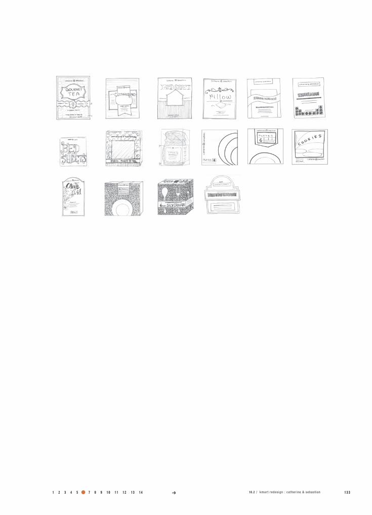
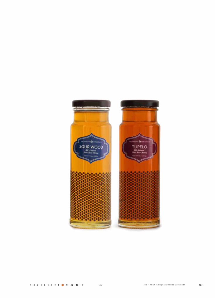
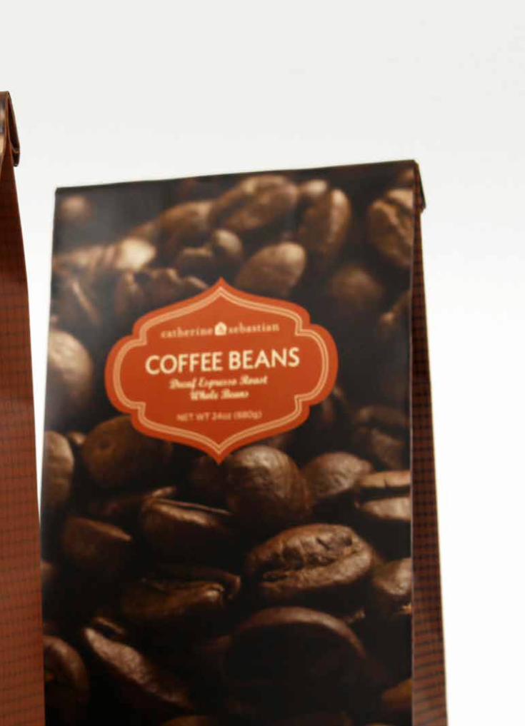
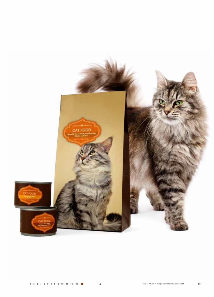
10.2CATHERInE & SEbASTIAn
Redesign Kmart’s packaging by developing a revitalized and refocused branding system that would exceed Target’s own system.
Create a premium line of home, food and pet products offering higher end, reliable comforts through smart design and quality.
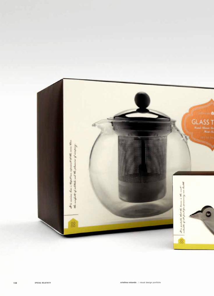
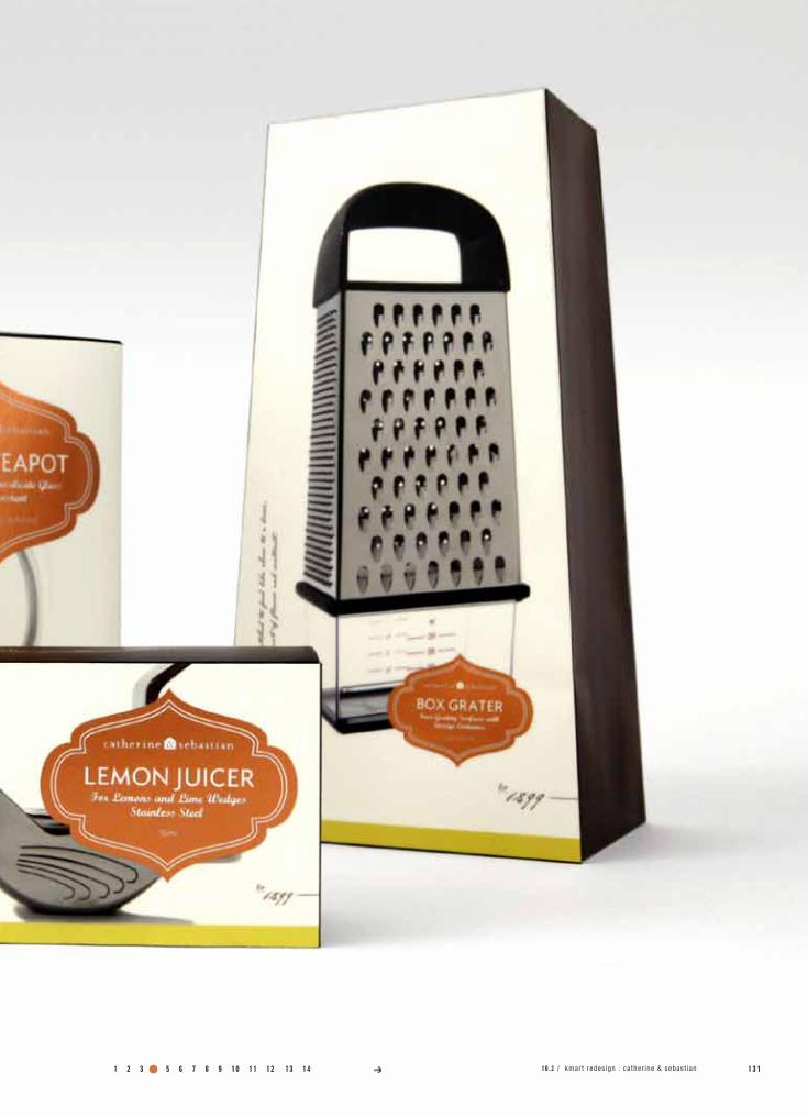
Sebastian Spering Kresge began his legacy with a handful of small stores called Kresge’s Five and Dime. Through profitable business practices, Sebastian went on to form this well-known retail company, Kmart.
Sebastian Spering Kresge was born July 31, 1867 to Sebastian and Catherine (Kunkle) Kresge. His strong Pennsylvania Dutch upbringing of a belief in hard work, and thrift was inspiration for us to create a premium line that offers higher end, reliable comforts through smart design and quality to hard working people all over the country who deserve to spoil themselves at an affordable price. Catherine & Sebastian is this line, dedicated to Kmart’s traditions of thrift, while looking forward towards a more modern, luxurious product and design experience.
class name /
instructor /
printer /
photography /
Pack 4
Michael Osborne
Plotnet
Daniel Castro
specs /
1 2 8 S P E C I A L R E L A T I V I T Y cristina rotundo visual design portfolio/

a.)
b.)
specimens /
Logo
Packaging
1 2 3 4 5 6 7 8 9 10 11 12 1 2 910 .2 / kmar t redes ign : ca ther ine & sebast ian13 14
1 3 0 S P E C I A L R E L A T I V I T Y cristina rotundo visual design portfolio/
1 2 3 4 5 6 7 8 9 10 11 12 1 3 110 .2 / kmar t redes ign : ca ther ine & sebast ian13 14

1 3 2 S P E C I A L R E L A T I V I T Y cristina rotundo visual design portfolio/
1 2 3 4 5 6 7 8 9 10 11 12 1 3 313 14 10 .2 / kmar t redes ign : ca ther ine & sebast ian

1 3 4 S P E C I A L R E L A T I V I T Y cristina rotundo visual design portfolio/

1 2 3 4 5 6 7 8 9 10 11 12 1 3 510 .2 / kmar t redes ign : ca ther ine & sebast ian13 14

1 3 6 S P E C I A L R E L A T I V I T Y cristina rotundo visual design portfolio/
1 2 3 4 5 6 7 8 9 10 11 12 1 3 710 .2 / kmar t redes ign : ca ther ine & sebast ian13 14


1 4 0 S P E C I A L R E L A T I V I T Y cristina rotundo visual design portfolio/
1 2 3 4 5 6 7 8 9 10 11 12 1 4 110 .2 / kmar t redes ign : ca ther ine & sebast ian13 14
1 4 2 S P E C I A L R E L A T I V I T Y cristina rotundo visual design portfolio/
project no. / objective /
solution /
field of reference /
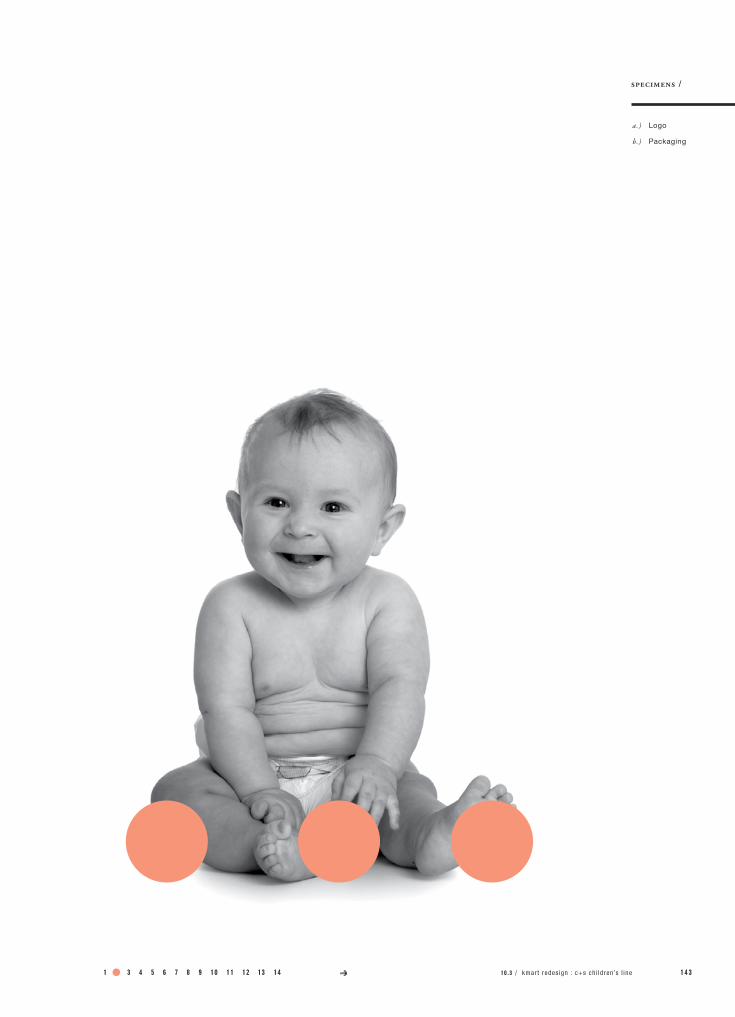
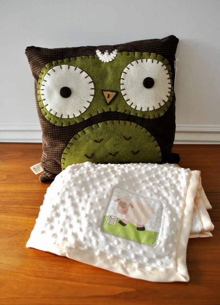
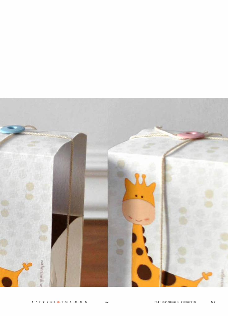
10.3C+S CHILdREn’S LInE
Redesign Kmart’s packaging by developing a revitalized and refocused branding system that would exceed Target’s own system.
Create a premium line of children’s food, accessories and clothing, which offers value to the parent through reliable quality and design.
c+s is Kmart’s premium children’s line inspired by the quality and luxury of Catherine & Sebastian. Through research, we determined that, though Kmart might believe they are targeting the young female shopper with children, it has lost site of it’s demographic and are actually targeting 55+, low income persons. While Kmart should focus on catering to their current clients, they should be focusing on recovering their original demographic and capturing new shoppers for the future.
c+s is designed to appeal to these families with young children, specifically, young mothers, who want a one stop shopping “experience” for name brands that are cost effective for their families. c+s is also designed to attract the more affluent consumer who appreciates quality, but who are also price conscious.
class name /
instructor /
model maker /
Pack 4
Michael Osborne
California Model
specs /
1 2 3 4 5 6 7 8 9 10 11 12 1 4 3
a.)
b.)
specimens /
Logo
Packaging
10 .3 / kmar t redes ign : c+s ch i ld ren ’s l ine13 14

1 4 4 S P E C I A L R E L A T I V I T Y cristina rotundo visual design portfolio/
1 2 3 4 5 6 7 8 9 10 11 12 1 4 5kmart redesign / c+s children’s line

1 4 6 S P E C I A L R E L A T I V I T Y cristina rotundo visual design portfolio/
1 2 3 4 5 6 7 8 9 10 11 12 1 4 710 .3 / kmar t redes ign : c+s ch i ld ren ’s l ine13 14

1 4 8 S P E C I A L R E L A T I V I T Y cristina rotundo visual design portfolio/
1 2 3 4 5 6 7 8 9 10 11 12 1 4 910 .3 / kmar t redes ign : c+s ch i ld ren ’s l ine13 14
1 5 0 S P E C I A L R E L A T I V I T Y cristina rotundo visual design portfolio/

1 2 3 4 5 6 7 8 9 10 11 12 1 5 1kmart redesign / c+s children’s line
1 5 2 S P E C I A L R E L A T I V I T Y cristina rotundo visual design portfolio/

1 2 3 4 5 6 7 8 9 10 11 12 1 5 313 14 10 .3 / kmar t redes ign : c+s ch i ld ren ’s l ine
1 5 4 S P E C I A L R E L A T I V I T Y cristina rotundo visual design portfolio/
1 2 3 4 5 6 7 8 9 10 11 12 1 5 513 14 10 .3 / kmar t redes ign : c+s ch i ld ren ’s l ine
project no. / objective /
solution /
field of reference /
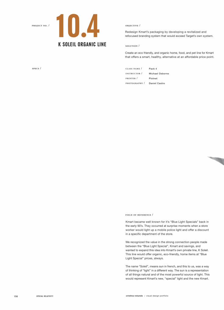
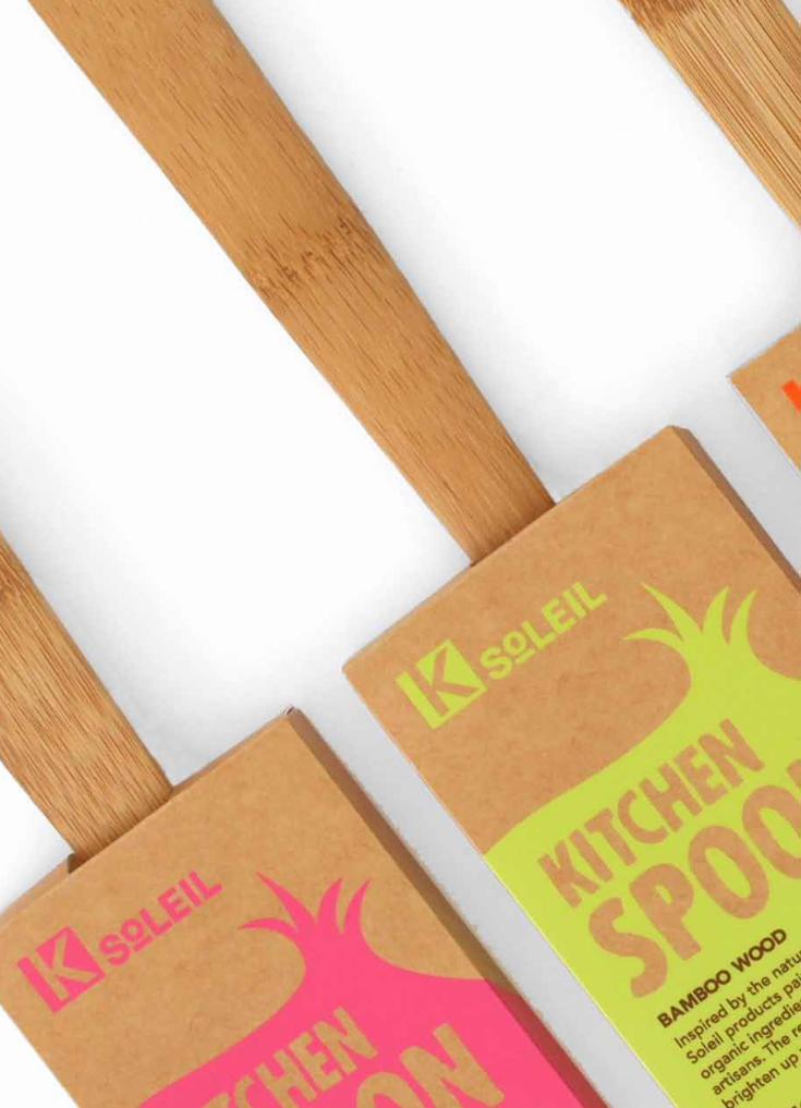
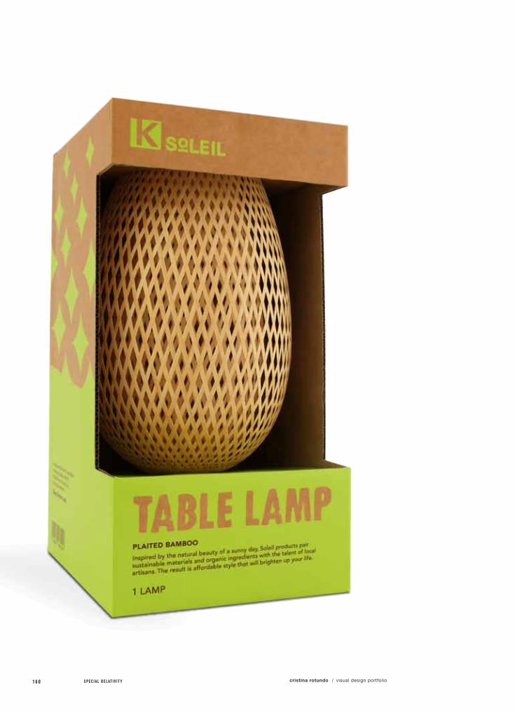
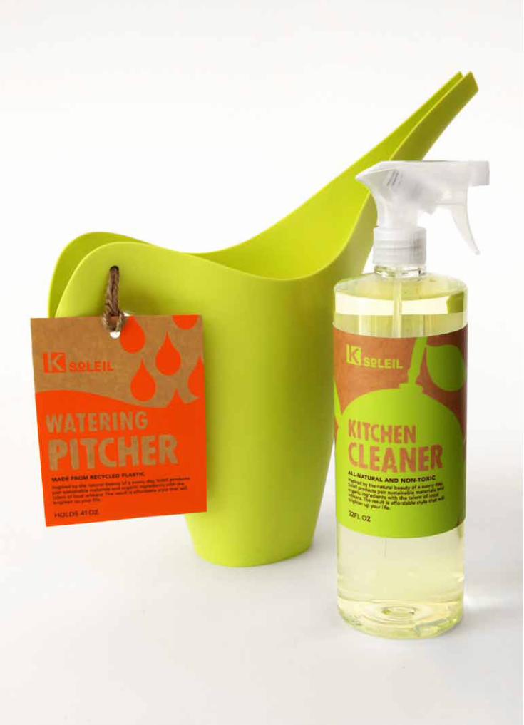
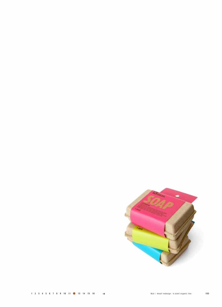
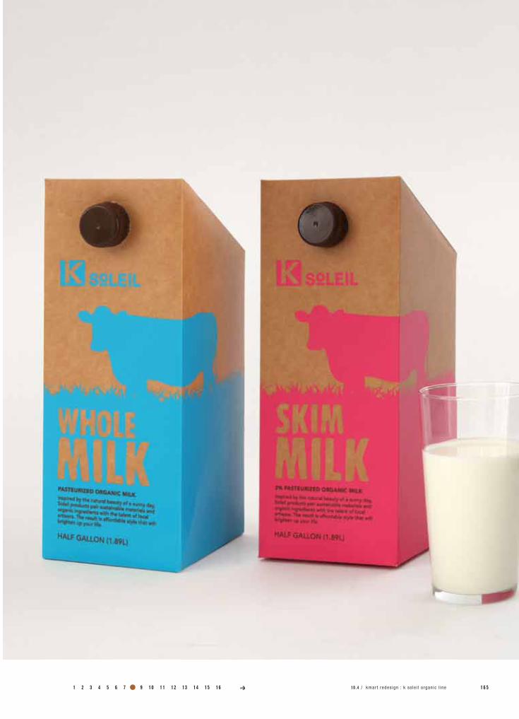
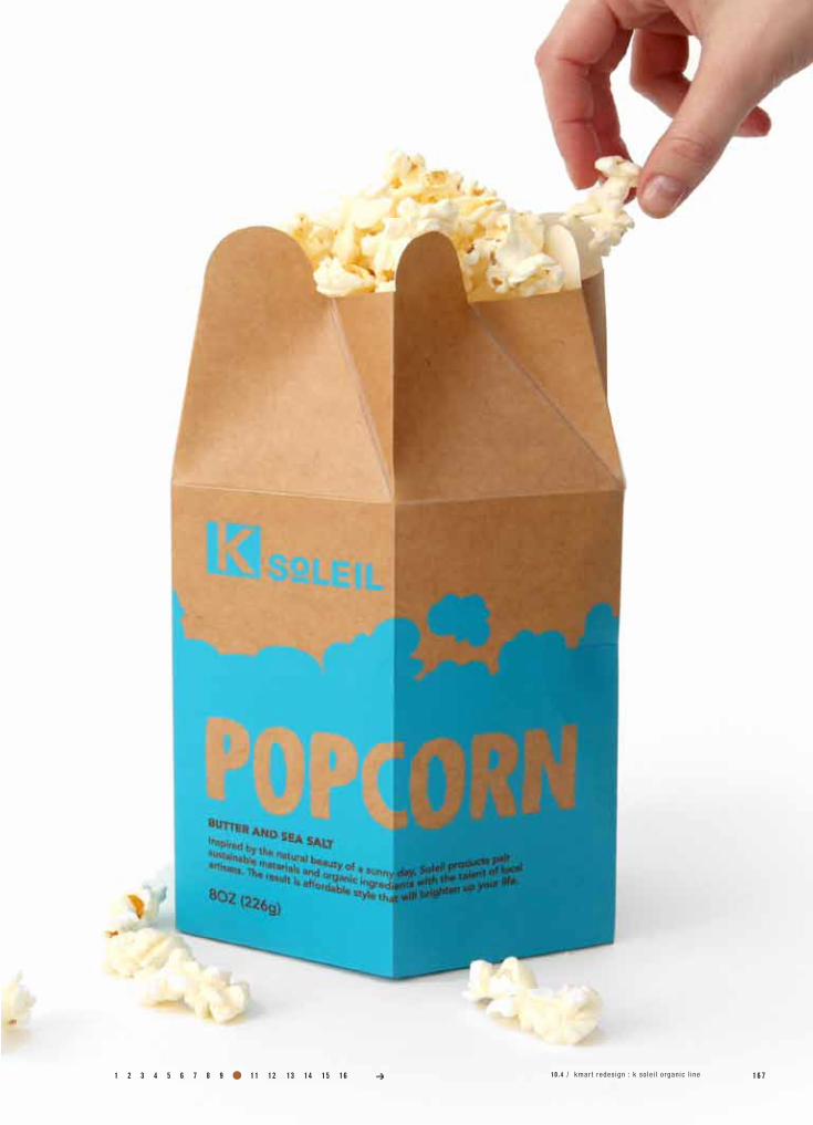
10.4K SoLEIL oRgAnIC LInE
Redesign Kmart’s packaging by developing a revitalized and refocused branding system that would exceed Target’s own system.
Create an eco friendly, and organic home, food, and pet line for Kmart that offers a smart, healthy, alternative at an affordable price point.
class name /
instructor /
printer /
photography /
Pack 4
Michael Osborne
Plotnet
Daniel Castro
specs /
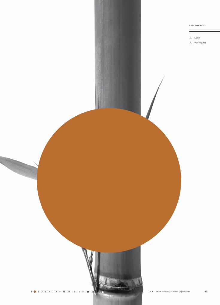
Kmart became well known for it’s “Blue Light Specials” back in the early 90’s. They occurred at surprise moments when a store worker would light up a mobile police light and offer a discount in a specific department of the store.
We recognized the value in the strong connection people made between the “Blue Light Special”, Kmart and savings, and wanted to expand this idea into Kmart’s own private line, K Soleil. This line would offer organic, eco-friendly, home items at “Blue Light Special” prices, always.
The name “Soleil”, means sun in french, and this to us, was a way of thinking of “light” in a different way. The sun is a representation of all things natural and of the most powerful source of light. This would represent Kmart’s new, “special” light and the new Kmart.
1 5 6 S P E C I A L R E L A T I V I T Y cristina rotundo visual design portfolio/
a.)
b.)
specimens /
Logo
Packaging
1 2 3 4 5 6 7 8 9 10 11 12 1 5 710 .4 / kmar t redes ign : k so le i l o rgan ic l ine13 14 15 16
1 5 8 S P E C I A L R E L A T I V I T Y cristina rotundo visual design portfolio/

1 2 3 4 5 6 7 8 9 10 11 12 1 5 910 .4 / kmar t redes ign : k so le i l o rgan ic l ine13 14 15 16
1 6 0 S P E C I A L R E L A T I V I T Y cristina rotundo visual design portfolio/

1 2 3 4 5 6 7 8 9 10 11 12 1 6 1kmart redesign / soleil organic line13 14 15 16
1 6 2 S P E C I A L R E L A T I V I T Y cristina rotundo visual design portfolio/
1 2 3 4 5 6 7 8 9 10 11 12 1 6 310 .4 / kmar t redes ign : k so le i l o rgan ic l ine13 14 15 16

1 6 4 S P E C I A L R E L A T I V I T Y cristina rotundo visual design portfolio/
1 2 3 4 5 6 7 8 9 10 11 12 1 6 510 .4 / kmar t redes ign : k so le i l o rgan ic l ine13 14 15 16

1 6 6 S P E C I A L R E L A T I V I T Y cristina rotundo visual design portfolio/
1 2 3 4 5 6 7 8 9 10 11 12 1 6 710 .4 / kmar t redes ign : k so le i l o rgan ic l ine13 14 15 16
1 6 8 S P E C I A L R E L A T I V I T Y cristina rotundo visual design portfolio/
1 2 3 4 5 6 7 8 9 10 11 12 1 6 910 .4 / kmar t redes ign : k so le i l o rgan ic l ine13 14 15 16
1 7 0 S P E C I A L R E L A T I V I T Y cristina rotundo visual design portfolio/

1 2 3 4 5 6 7 8 9 10 11 12 1 7 110 .4 / kmar t redes ign : k so le i l o rgan ic l ine13 14 15 16
1 7 2 S P E C I A L R E L A T I V I T Y cristina rotundo visual design portfolio/
project no. / objective /
solution /
field of reference /
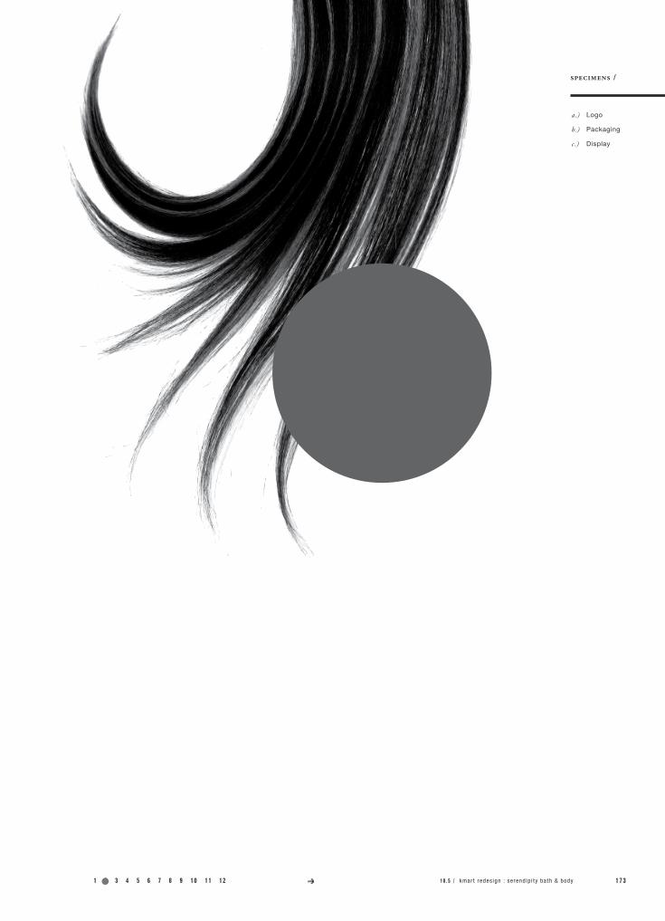
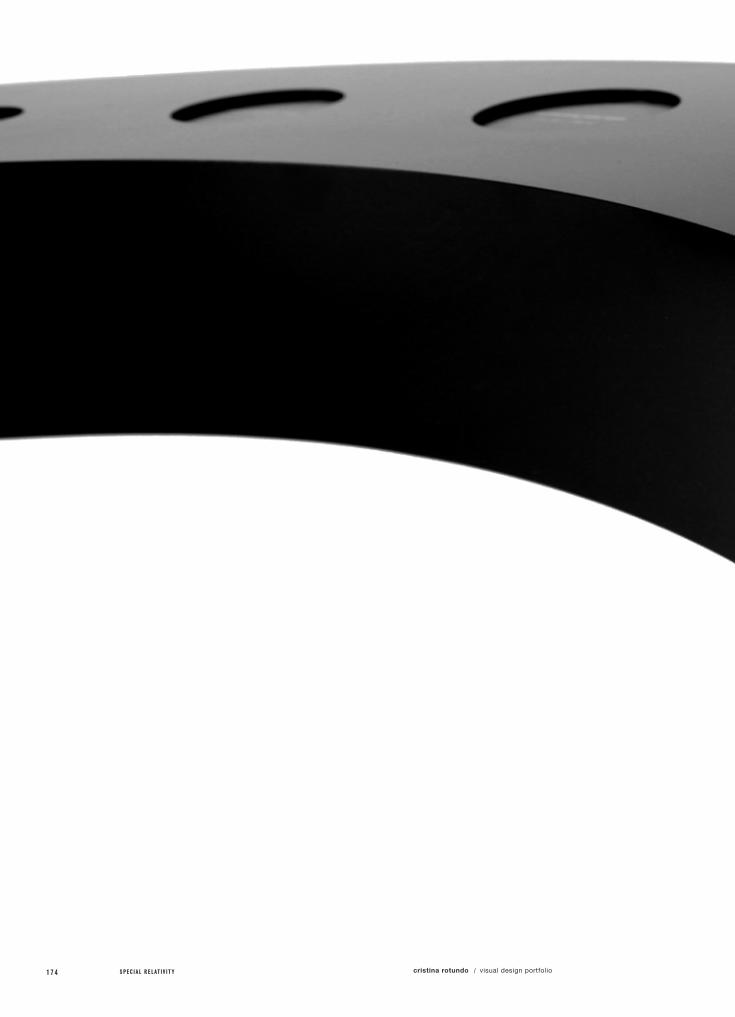
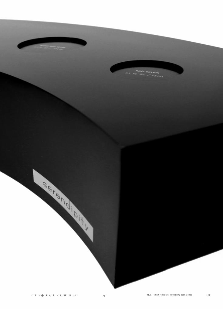
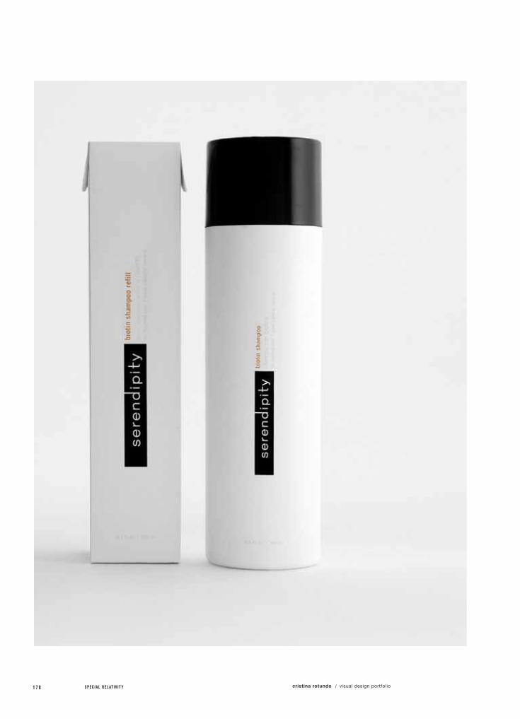
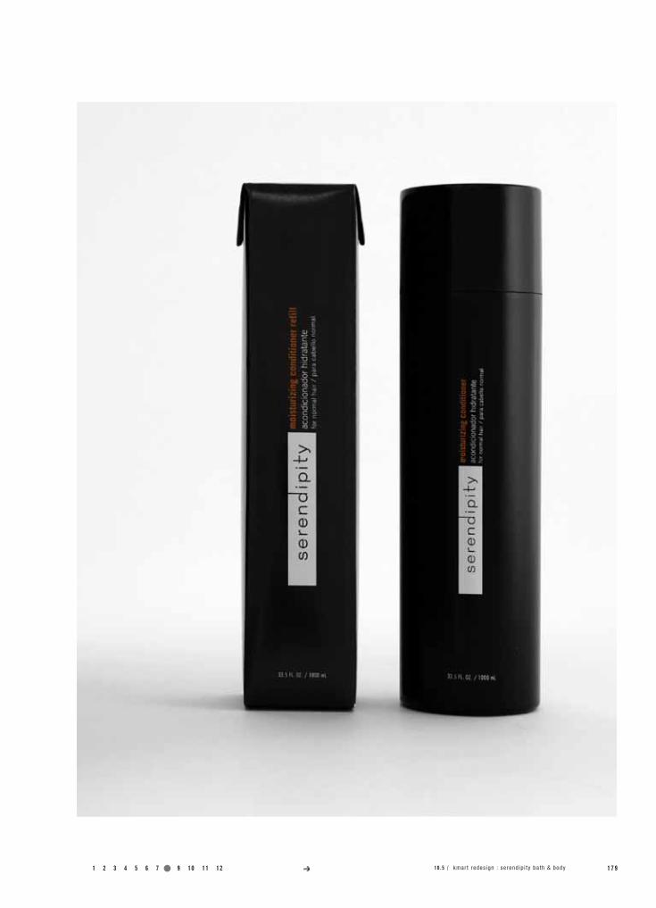
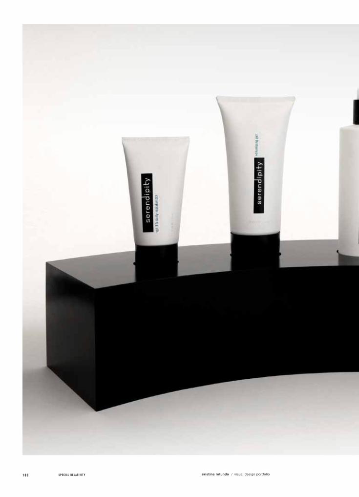
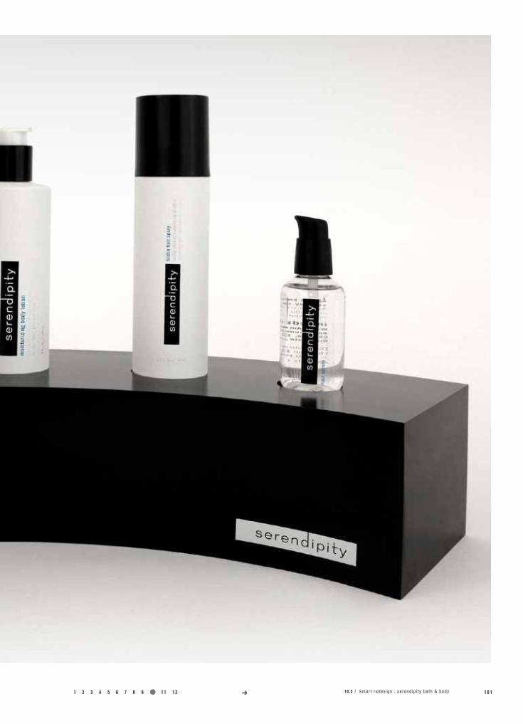
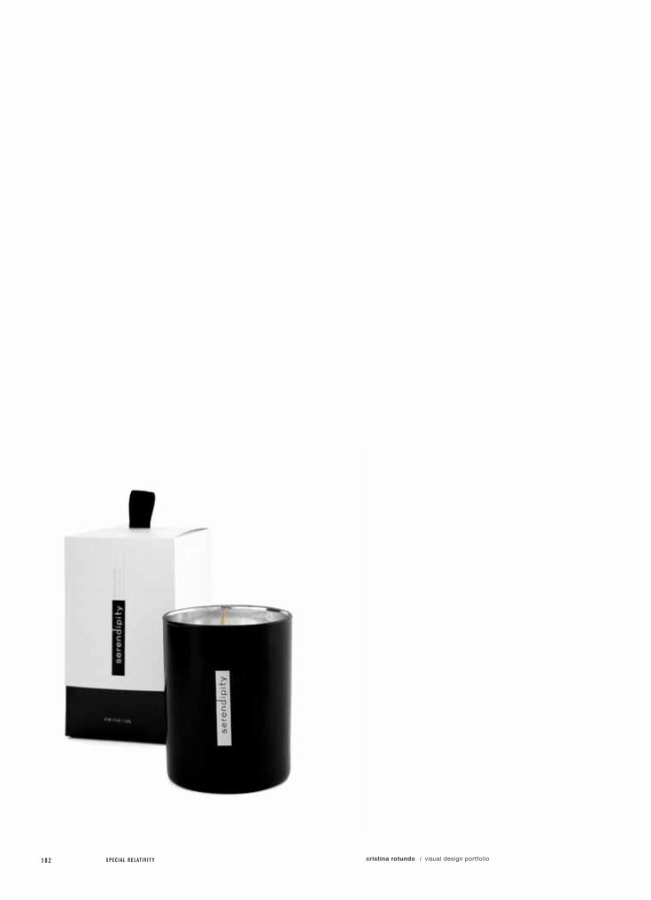
10.5SEREndIPITY bATH & bodY
Redesign Kmart’s packaging by developing a revitalized and refocused branding system that would exceed Target’s own system.
Create a line of bath and body products that offers healthy, beautifying formulas and higher end comforts at affordable prices
The word serendipity can be described as having a talent for making fortunate discoveries while searching for other things. “Serendipity” to us, represents a line of luxurious Kmart bath and body products that consumers would never expect to come across in a Kmart, but would feel fortunate in discovering it.
Because we wanted to target a younger, female audience, we create a line such as this within Kmart’s own salon and spa. Women would have the opportunity to pamper themselves while purchasing their day to day necessities at an affordable price, further enhancing the new Kmart shopping experience. We also wanted to stress a very gender neutral feel along with Spanish translations to create a sense of inclusiveness and appreciation towards their minority consumers.
class name /
instructor /
model maker /
photography /
Pack 4
Michael Osborne
Gemmeti Model Art
Daniel Castro
specs /
1 2 3 4 5 6 7 8 9 10 11 12 1 7 3
a.)
b.)
c.)
specimens /
Logo
Packaging
Display
10 .5 / kmar t redes ign : serend ip i ty ba th & body
1 7 4 S P E C I A L R E L A T I V I T Y cristina rotundo visual design portfolio/
1 2 3 4 5 6 7 8 9 10 11 12 1 7 510 .5 / kmar t redes ign : serend ip i ty ba th & body

1 7 6 S P E C I A L R E L A T I V I T Y cristina rotundo visual design portfolio/

1 2 3 4 5 6 7 8 9 10 11 12 1 7 710 .5 / kmar t redes ign : serend ip i ty ba th & body
1 7 8 S P E C I A L R E L A T I V I T Y cristina rotundo visual design portfolio/
1 2 3 4 5 6 7 8 9 10 11 12 1 7 910 .5 / kmar t redes ign : serend ip i ty ba th & body
1 8 0 S P E C I A L R E L A T I V I T Y cristina rotundo visual design portfolio/
1 2 3 4 5 6 7 8 9 10 11 12 1 8 110 .5 / kmar t redes ign : serend ip i ty ba th & body
1 8 2 S P E C I A L R E L A T I V I T Y cristina rotundo visual design portfolio/

1 2 3 4 5 6 7 8 9 10 11 12 1 8 310 .5 / kmar t redes ign : serend ip i ty ba th & body

1 8 4 S P E C I A L R E L A T I V I T Y cristina rotundo visual design portfolio/
project no. / objective /
solution /
field of reference /
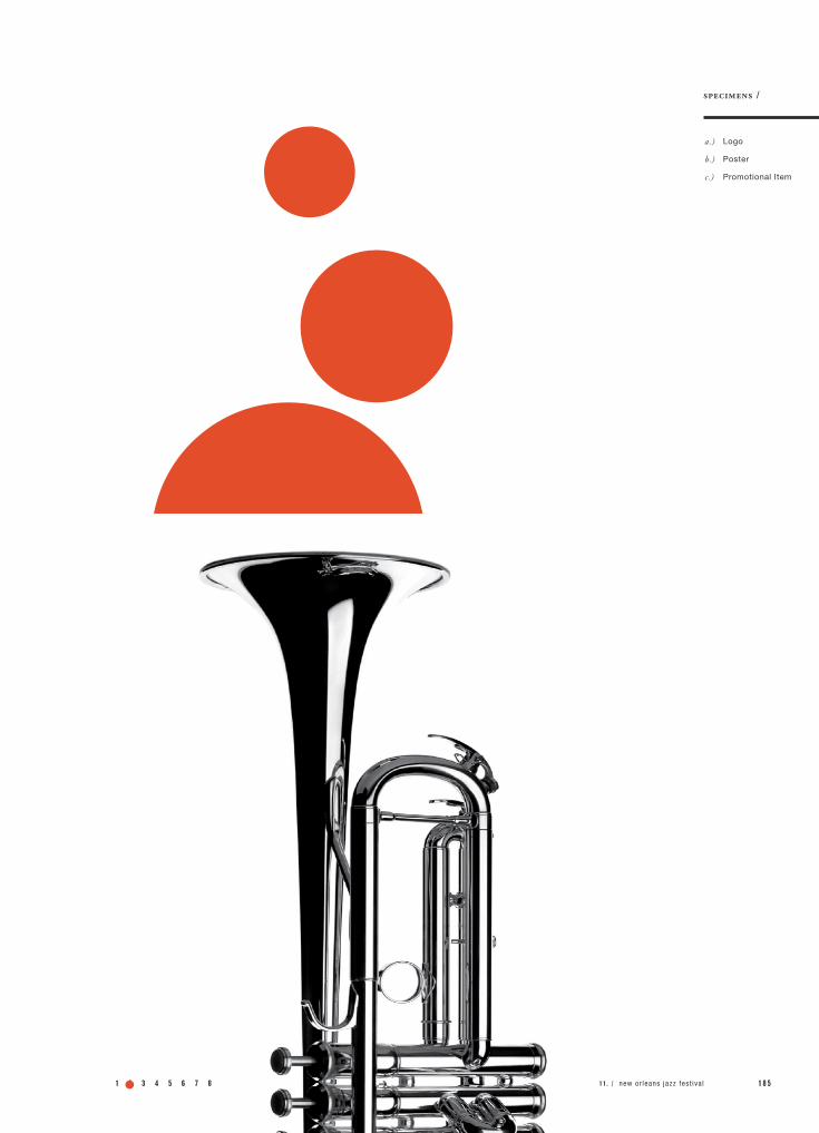
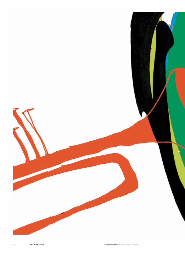
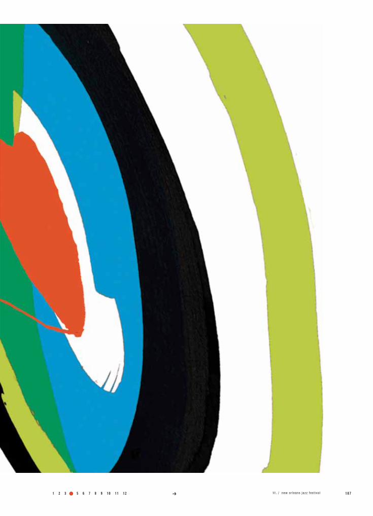
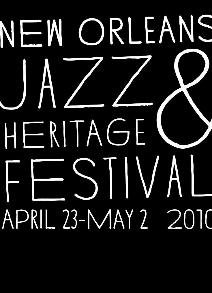
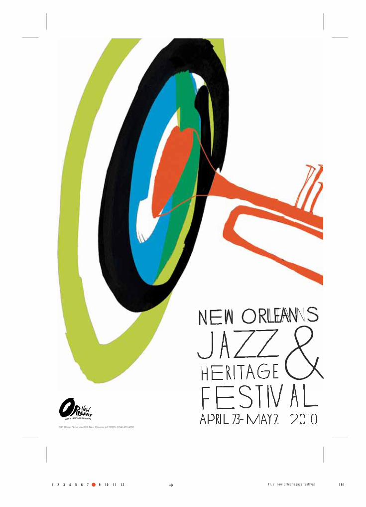
11.nEw oRLEAnS jAzz fESTIVAL
Create a revitalized identity and look for a festival of your choice and design a new logo, event poster and promotional item.
Design a fresh, iconic identity for the New Orleans Jazz Festival, while maintaining a feel of tradition that identifies with all generations.
class name /
instructor /
Identity 2
Dean Wilcox
specs /
According to the official New Orleans Jazz Fest website, “From the very beginning, the New Orleans Jazz & Heritage Festival was envisioned as an important event that would have great cultural significance and popular appeal. The Festival is the culmination of years of discussions and efforts by city leaders who wanted to create an event worthy of the city’s legacy as the birthplace of jazz.”
Because of this, it was very important for me to convey this sense of pride and culture. I graphically represented this by creating a vibrant and vibrating, colorful and organic emotion through the hand drawn trumpet and sound waves. It was also necessary to update the look of the current event identity while maintain-ing traditional symbols of jazz, such as the trumpet. Overall, I wanted the composition to evoke an uplifting, inviting, and iconic feel.
a.)
b.)
c.)
specimens /
Logo
Poster
Promotional Item
1 2 3 4 5 6 7 8 9 10 11 12 1 8 511 . / new or leans jazz fes t iva l
1 8 6 S P E C I A L R E L A T I V I T Y cristina rotundo visual design portfolio/
1 2 3 4 5 6 7 8 9 10 11 12 1 8 711 . / new or leans jazz fes t iva l
1 8 8 S P E C I A L R E L A T I V I T Y cristina rotundo visual design portfolio/

1 2 3 4 5 6 7 8 9 10 11 12 1 8 9
JAZZ & HERITAGE FESTIVAL
11 . / new or leans jazz fes t iva l

1 9 0 S P E C I A L R E L A T I V I T Y cristina rotundo visual design portfolio/
NET WT. 18oz. (510g)
R E D H OT S A U C E yo u’ r e i n vi ted !
1 2 3 4 5 6 7 8 9 10 11 12 1 9 1
NEW ORLEA NS
HE R I TAG E
FES T IV AL
J AZZ&Apri l 23- May 2 2010
336 Camp Street ste 250 New Orleans, LA 70130 (504) 410-4100
JAZZ & HERITAGE FESTIVAL
11 . / new or leans jazz fes t iva l
1 9 2 S P E C I A L R E L A T I V I T Y cristina rotundo visual design portfolio/
project no. / objective /
solution /
field of reference /
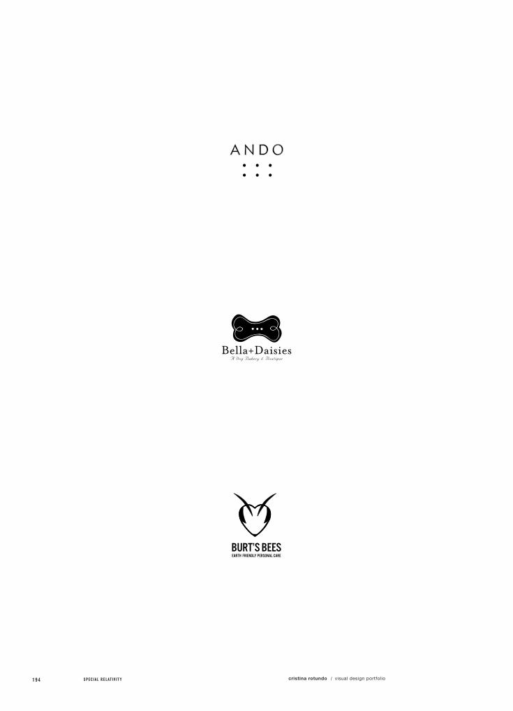
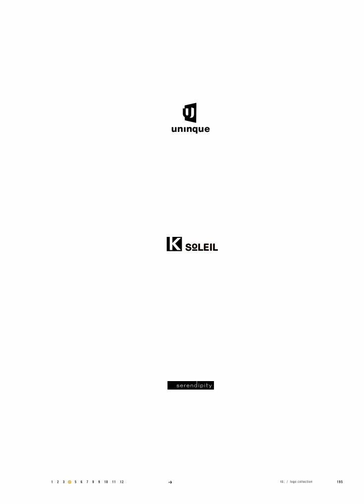
12.Logo CoLLECTIon
All identities require marks that communicate the name, personality and value of the person, company or place.
Through thorough research and understanding of a subject's identity, create a logo that will represent it in the most effective way.
This section is a collection of some of my strongest logos created over the term of my degree. They are presented in both black and white and in color. Each was developed through extensive research and acquired appreciation for my “client”. They are all the back bone of every identity, so therefore, must represent exactly what the client is all about in the simplest, boldest, most honest and effective way possible.
class name /
instructor /
Various
Various
specs /

1 2 3 4 5 6 7 8 9 10 11 12 1 9 3
a.)
b.)
specimens /
Logos (b&w)
Logos (color)
12 . / l ogo co l lec t ion
1 9 4 S P E C I A L R E L A T I V I T Y cristina rotundo visual design portfolio/
1 2 3 4 5 6 7 8 9 10 11 12 1 9 512 . / l ogo co l lec t ion
1 9 6 S P E C I A L R E L A T I V I T Y cristina rotundo visual design portfolio/
1 2 3 4 5 6 7 8 9 10 11 12 1 9 712 . / l ogo co l lec t ion
1 9 8 S P E C I A L R E L A T I V I T Y cristina rotundo visual design portfolio/
1 2 3 4 5 6 7 8 9 10 11 12 1 9 912 . / l ogo co l lec t ion

2 0 0 S P E C I A L R E L A T I V I T Y cristina rotundo visual design portfolio/
1 2 3 4 5 6 7 8 9 10 11 12 2 0 112 . / l ogo co l lec t ion

2 0 2 S P E C I A L R E L A T I V I T Y cristina rotundo visual design portfolio/

2 0 3
acknowledgments /
Family / To my loving mother Maria Gardella,
father Sal Rotundo, boyfriend Steve Javiel, sister
Angela, grandparents Angelo and Anna
Scozzafava, and step father David Gardella.
Faculty / To Mary Scott, Roland Young, Sue
Rowely, Michael Osborne, Tom McNulty, Max
Spector, Laura Milton, Chris Rolik, Carolyn
Meyer, Nathan Berneman.
Friends / To Peter Jan Synak, Jessica Willkens,
Maya Ostrander, Nicole Berman, Jayde Cardinalli,
Derek Smith, Maria Janosko, Eric Carnes, Caitlyn
Gibbons, Rika Putri.
Services / Plotnet, Califonia Model, H&H Imaging,
The Key Bindery, Alexanders Book Store,
Patricks & Co., Amazon, Flax, Kelly Paper, Paper
Source, Daniel Castro, Erdman Photography,
THAnK You

2 0 4 S P E C I A L R E L A T I V I T Y cristina rotundo visual design portfolio/

1 2 3 4 5 6 7 8 9 10 11 12 2 0 5

2 0 6 S P E C I A L R E L A T I V I T Y cristina rotundo visual design portfolio/